Brief: U&LC (Upper and Lower Case) magazine was published in print from 1973 to 1999. It showcased typographic design from a variety of sources and included ads from type makers and suppliers. In this academic project, I was tasked with a revitalization of the U&LC brand.
Process: I researched the original magazine (examples below) and worked to create a new logo, magazine cover, and spreads that would pay homage to the original work while bringing the publication forward into the 21st century, with a "Back to the future of type" concept, using original copy with updated images and layout
Tools: Adobe Illustrator, Photoshop. & InDesign
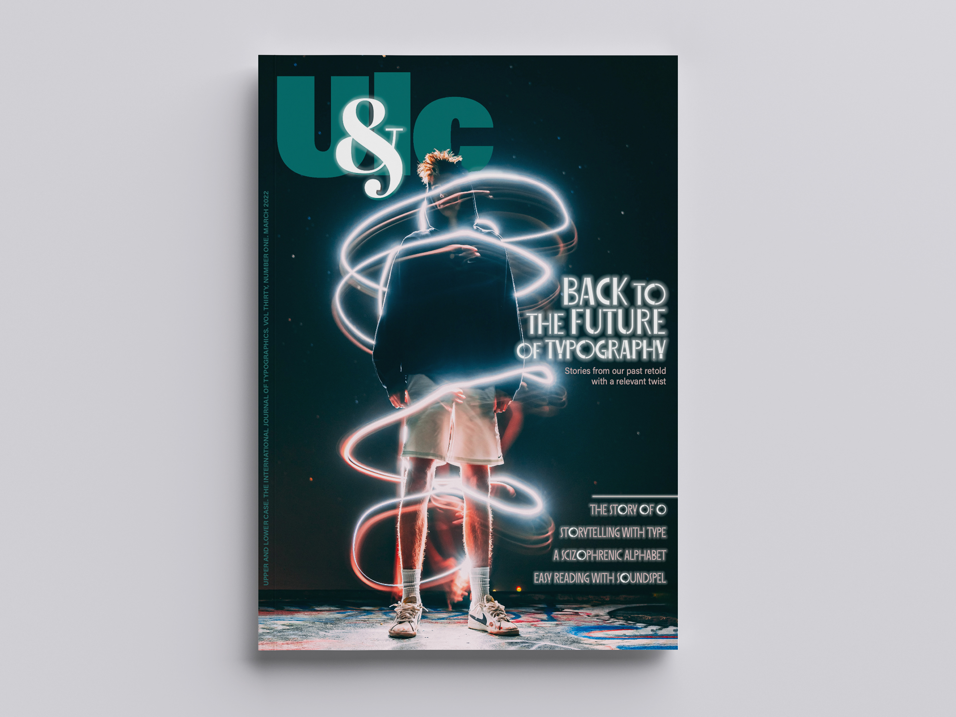
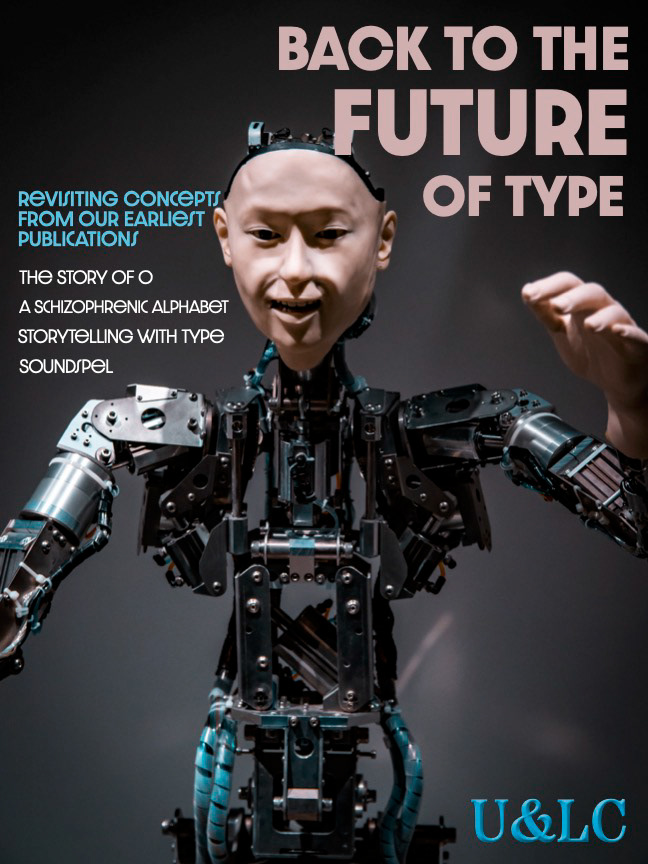
Cover design including new logo
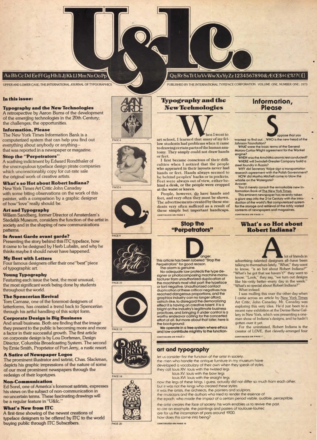
First U&LC Edition
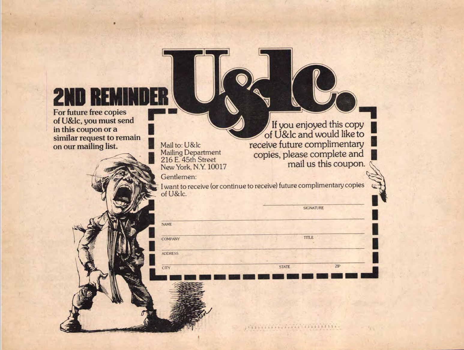
U&LC renewal ad
illustration

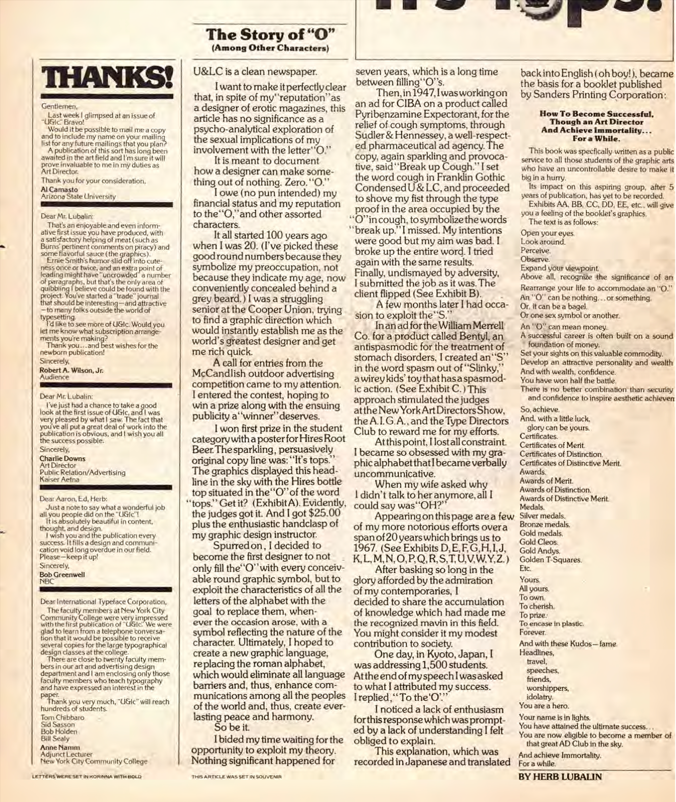
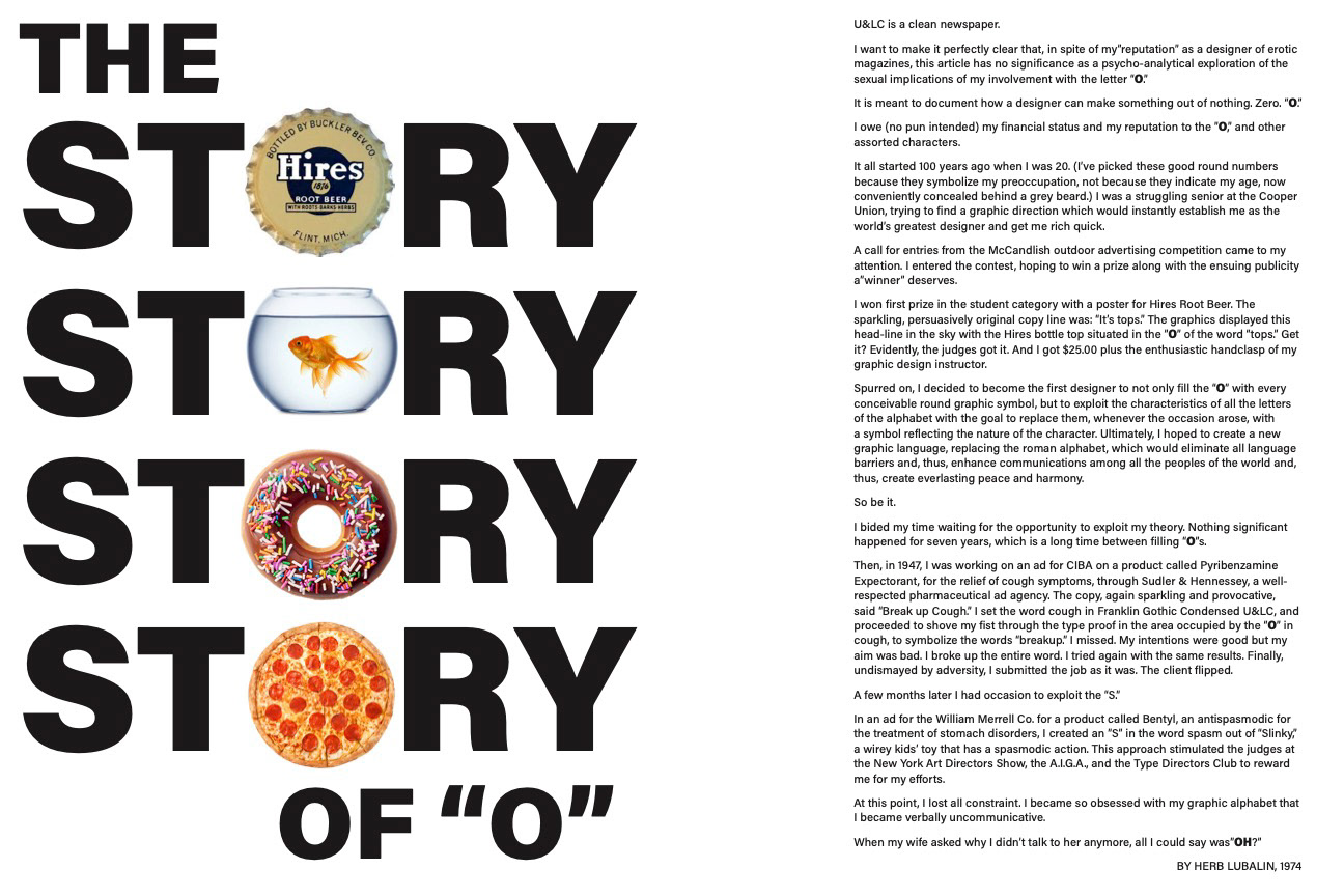
Original "Story of O" Article
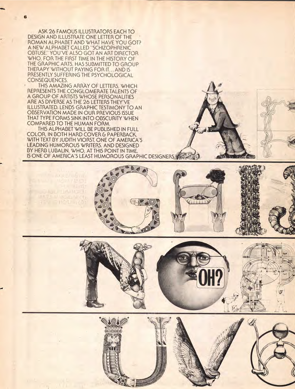
Original "Schizophrenic Alphabet" Article
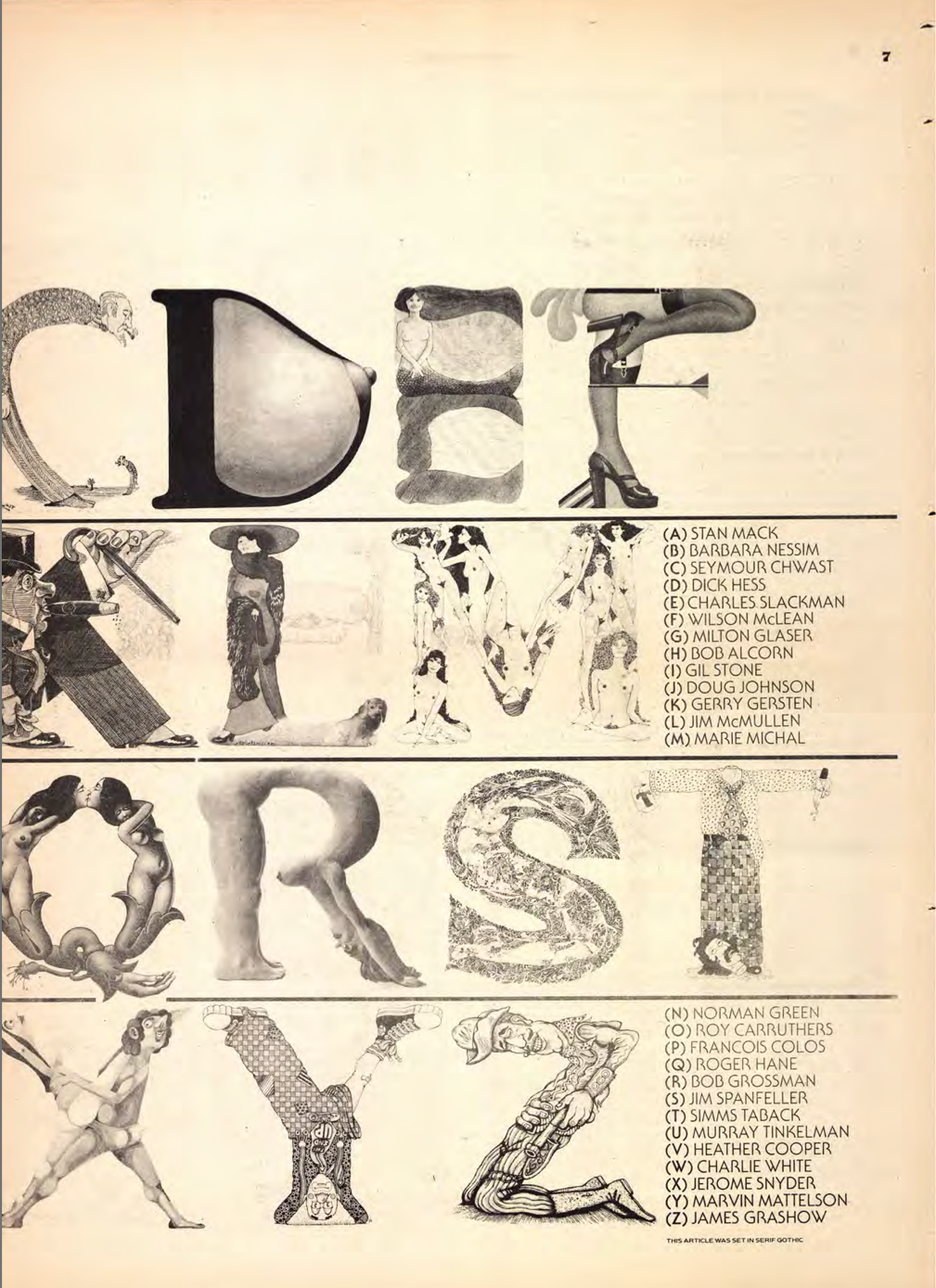
Original "Schizophrenic Alphabet" Article
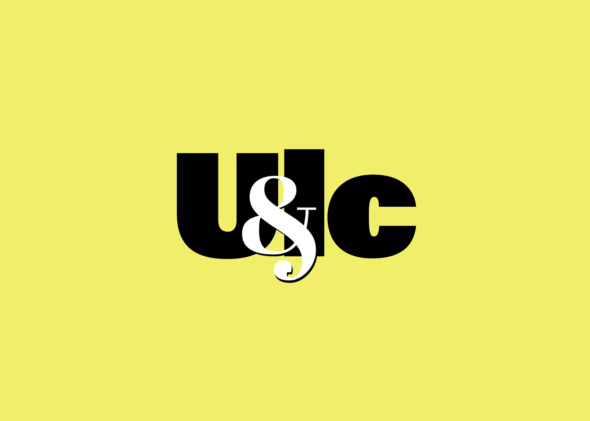
New Logo
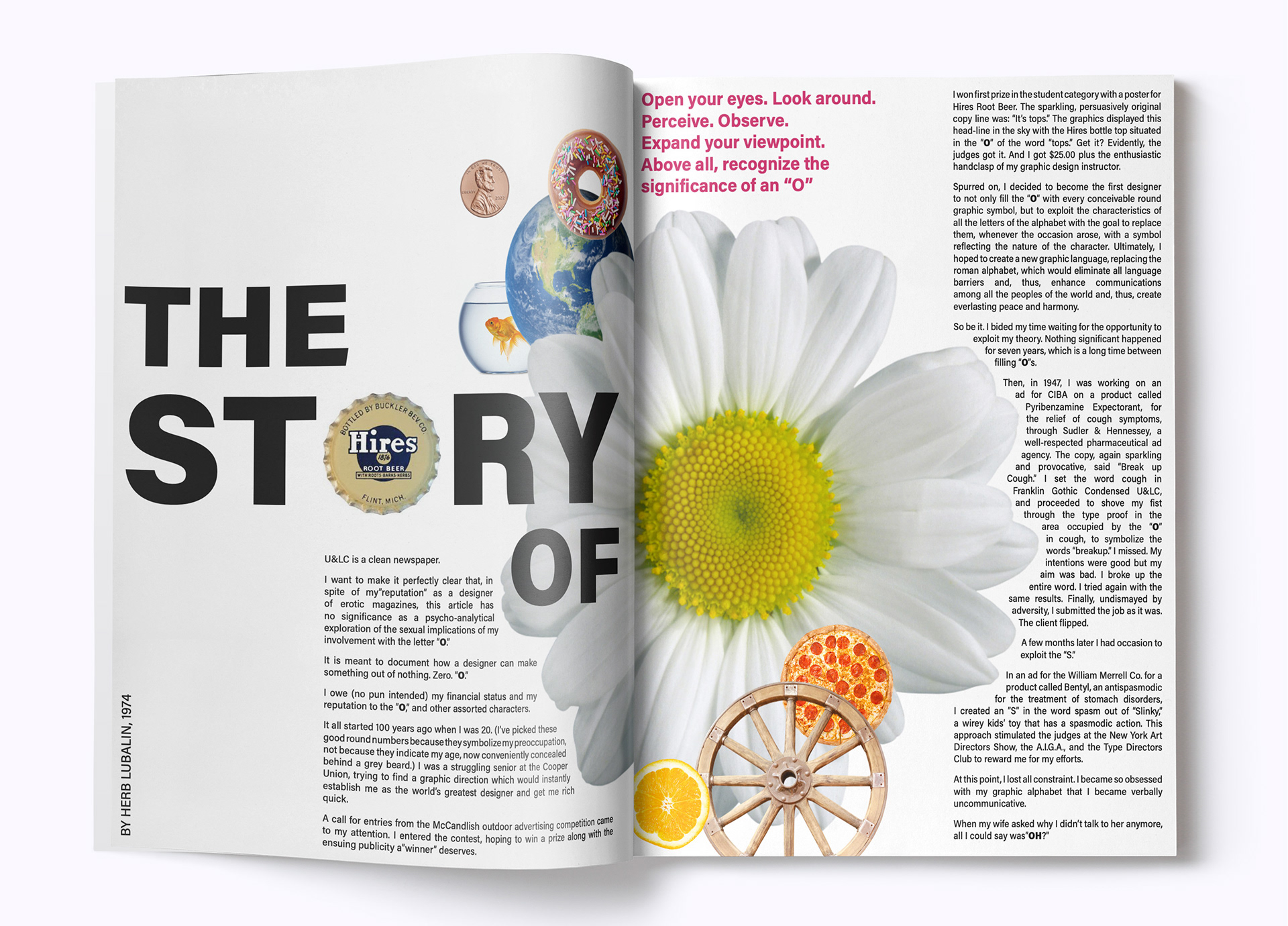
"The Story of O" spread design using original copy & updated images
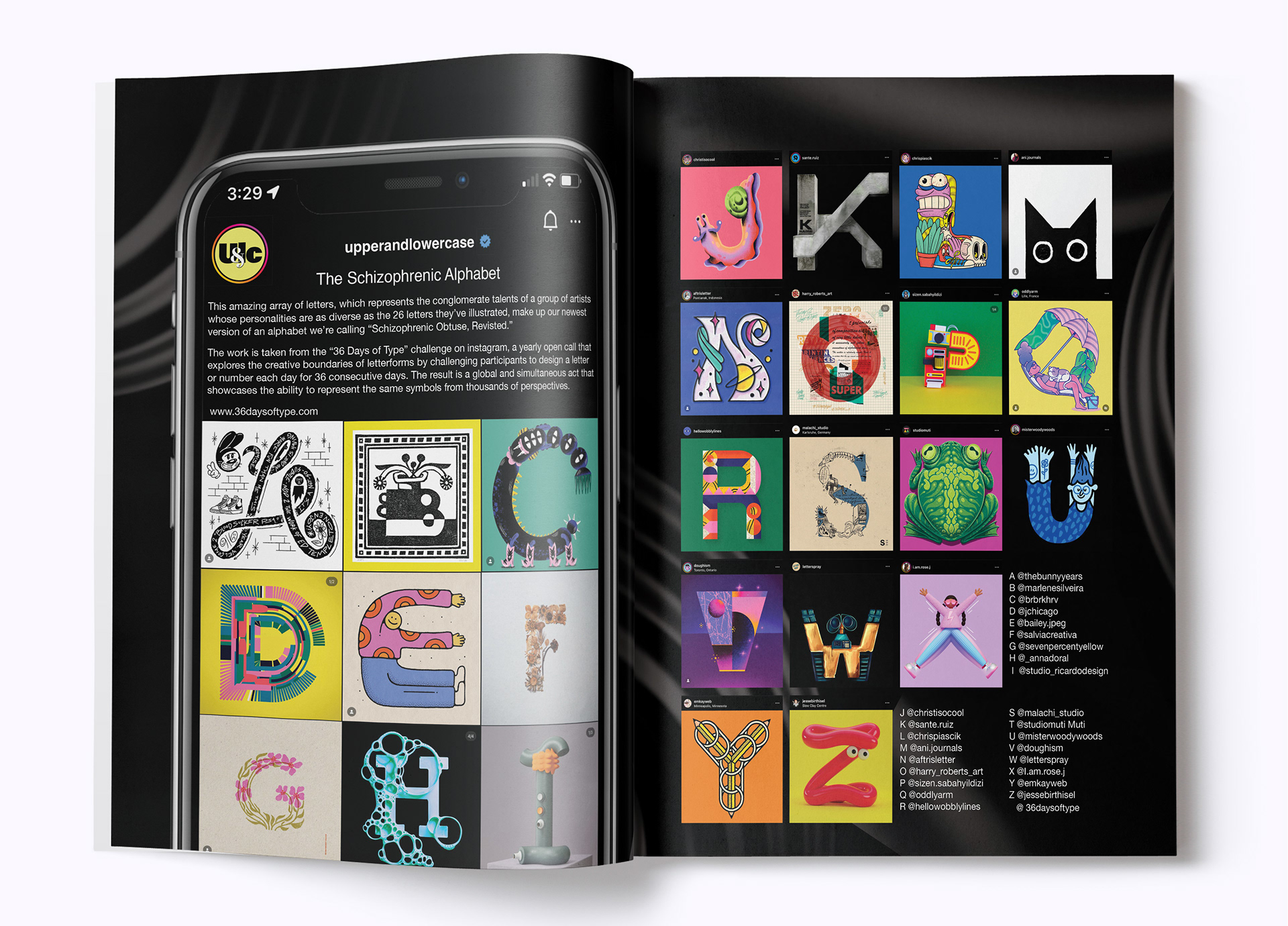
"The Schizophrenic Alphabet" spread design using original copy & updated images
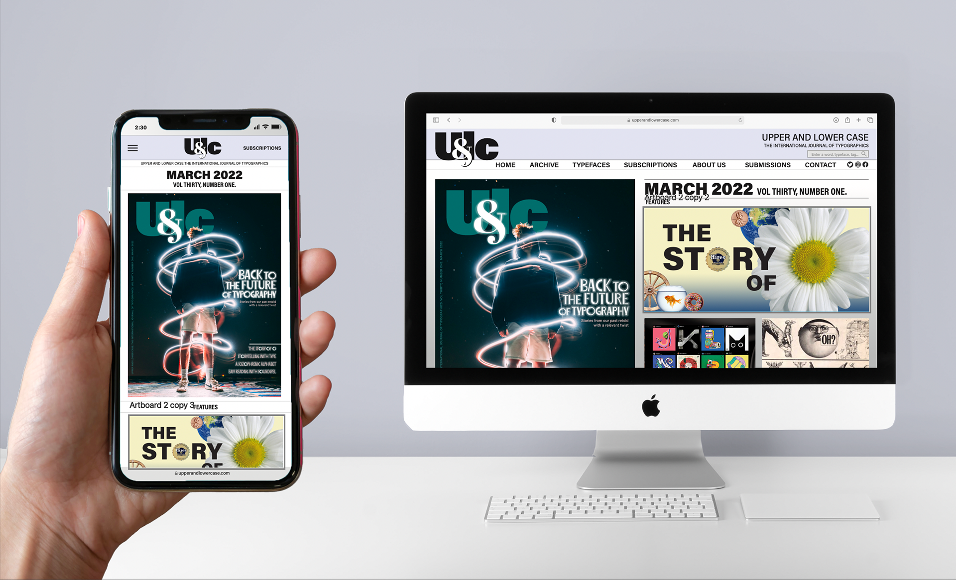
Web and mobile mockup
Process
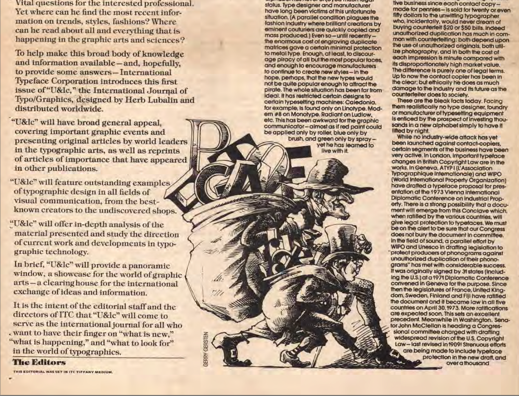
Problem: U&LC, a magazine celebrating typography, was in publication from the 70's to the 90's. The assignment was to bring U&LC into the present, redesigning a new logo, then creating a magazine cover and spreads.
Insight: U&LC famously played with typography, layouts, and images in experimental and exciting ways. I was able to find copies of old publications, and the articles were witty, interesting, and still relevant. I wanted to find a way to bring those pieces of writing into the present, in a "Back to the future of type" moment.
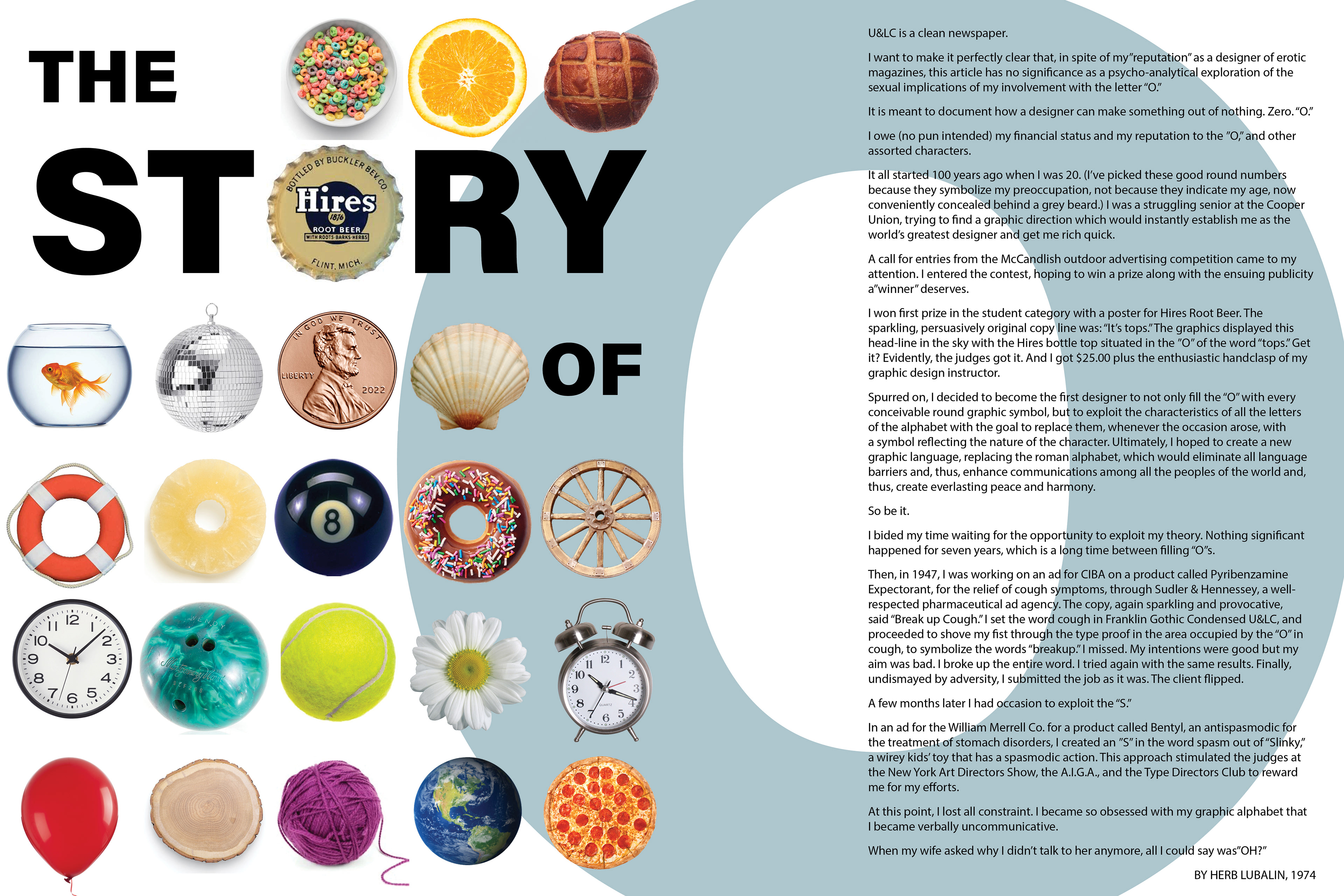
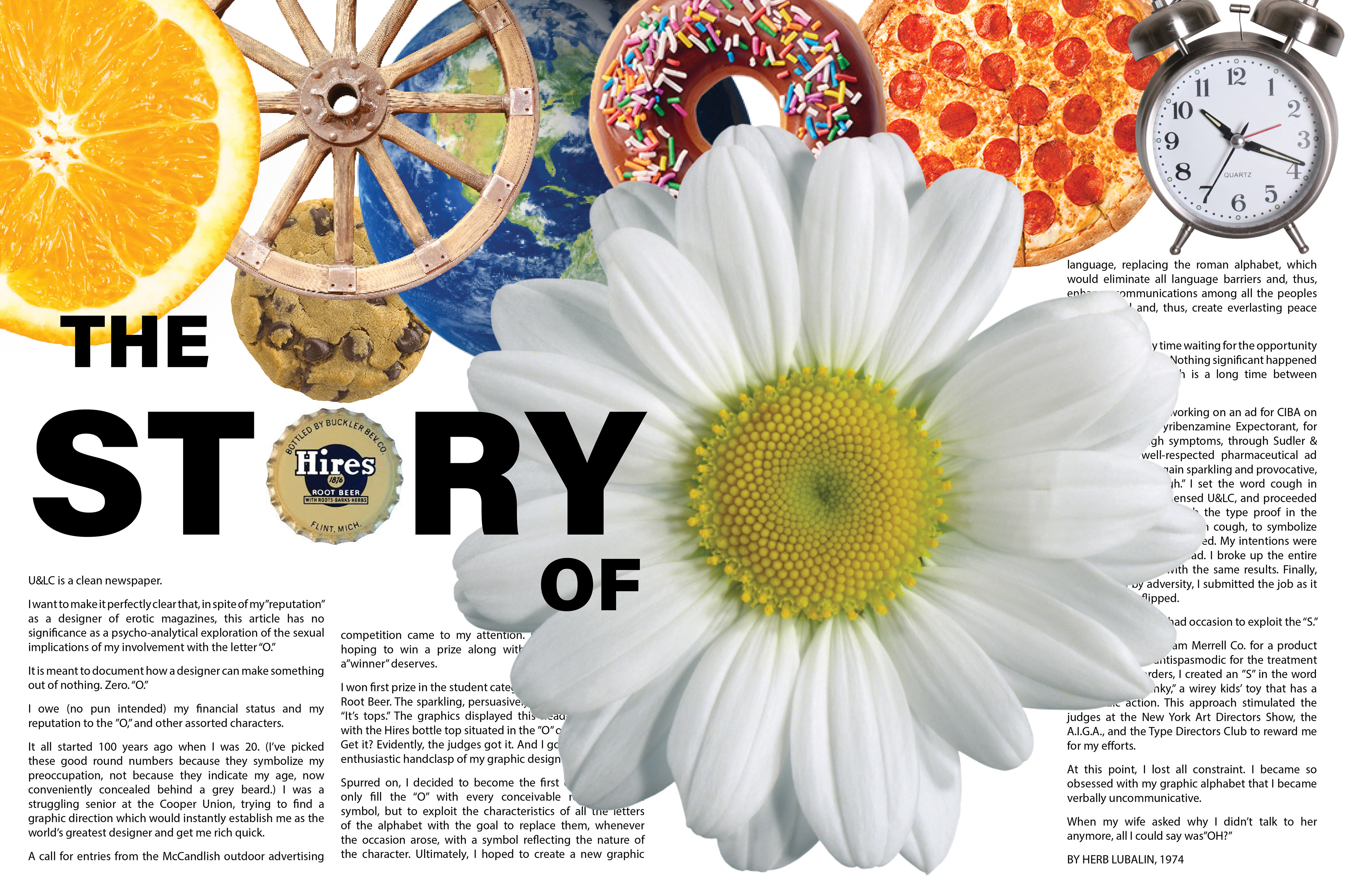
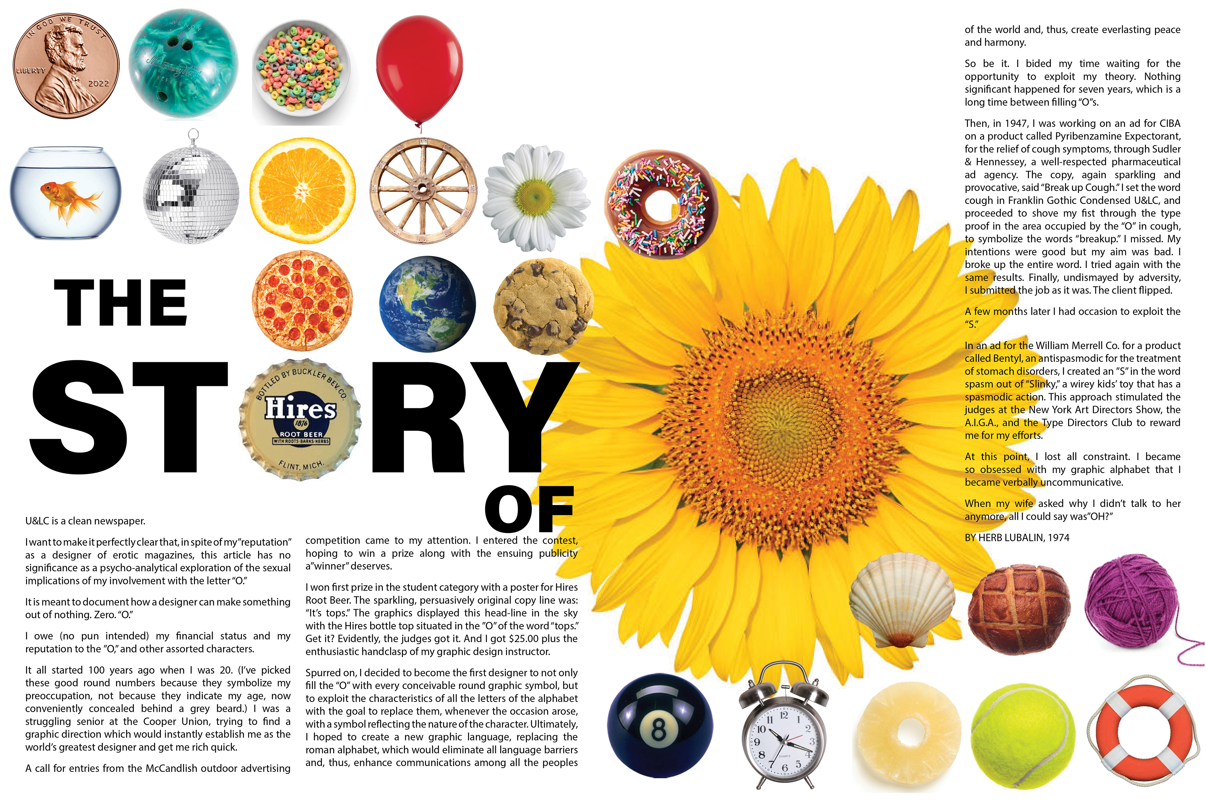
Solutions: The logo design paid homage to the original, but with a modern twist. The articles listed on the cover were all real articles from the past, staying true to the "Back to the future" theme. I created a spread based on "The Story of O." an article that talked about a design practice of using round objects in place of the letter O. The original had many black and white photos of O shaped objects, which I called back to with new color photos of round things. I then worked on a recreation of "The Schizophrenic Alphabet," finding 26 new illustrations of letters to incorporate into a modern version of the article.
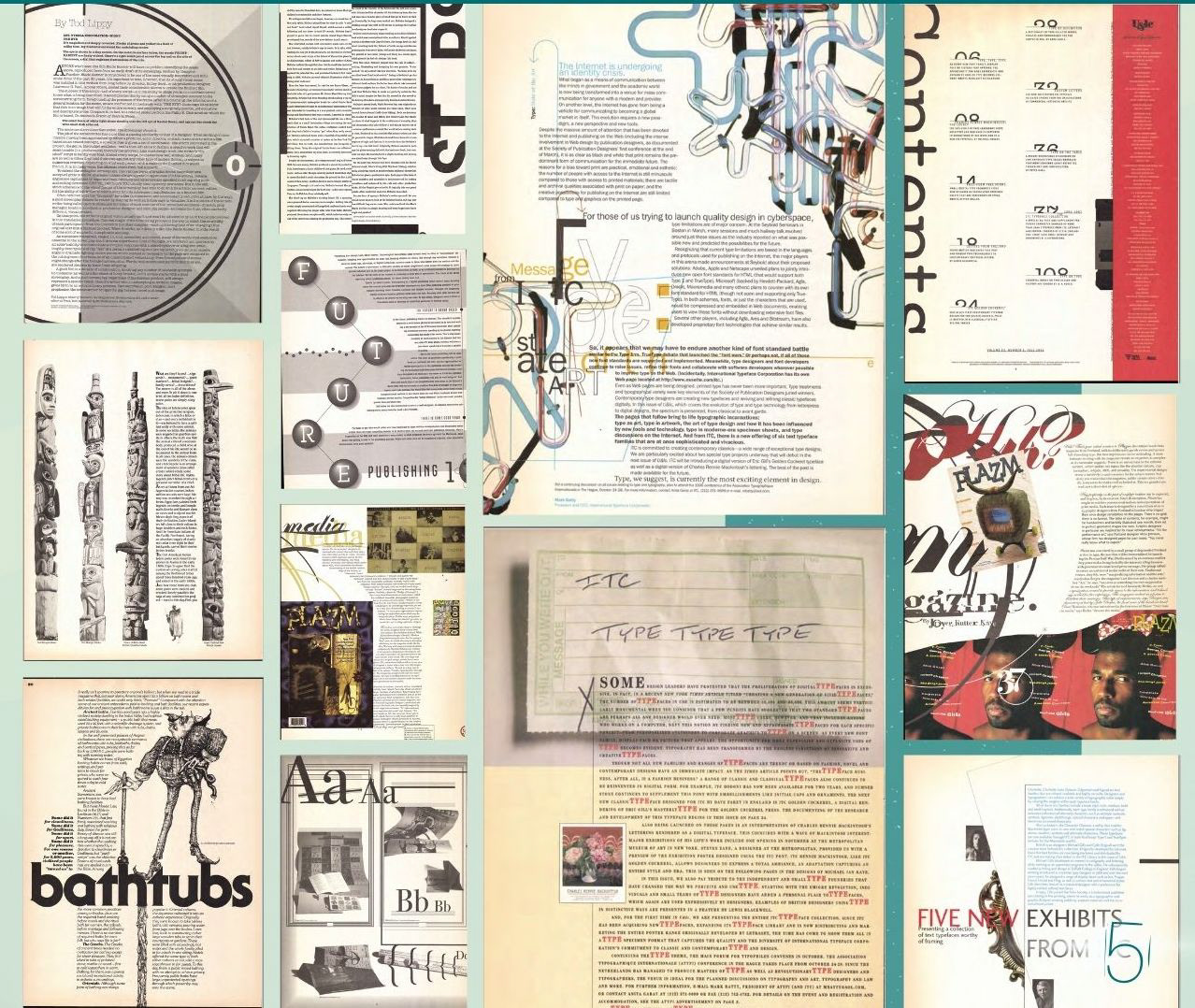
Research: Some of my favorite spreads from original U&LC editions
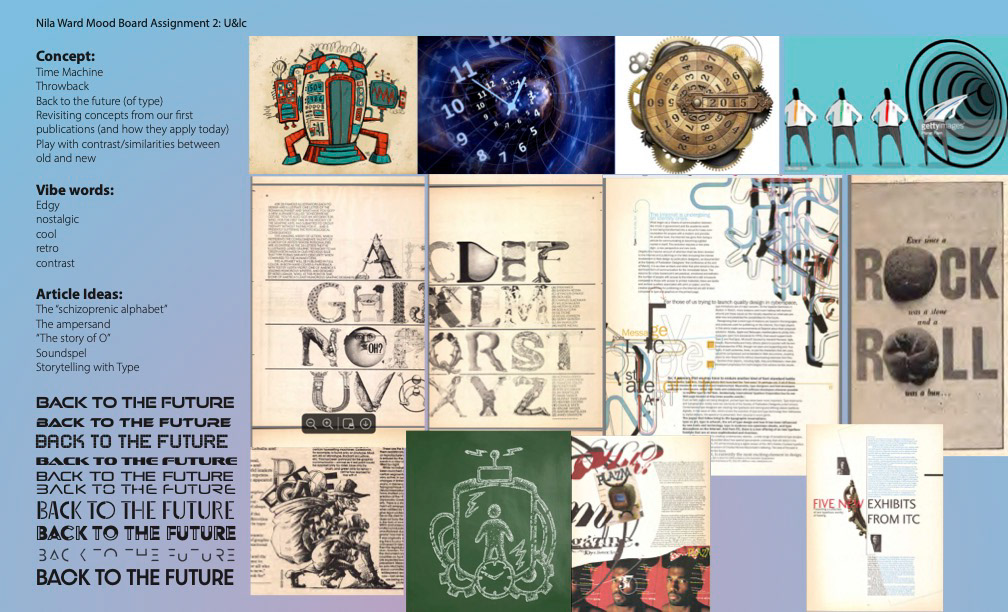
Mood board: play with the concept of a Time Machine, bringing the past into the future
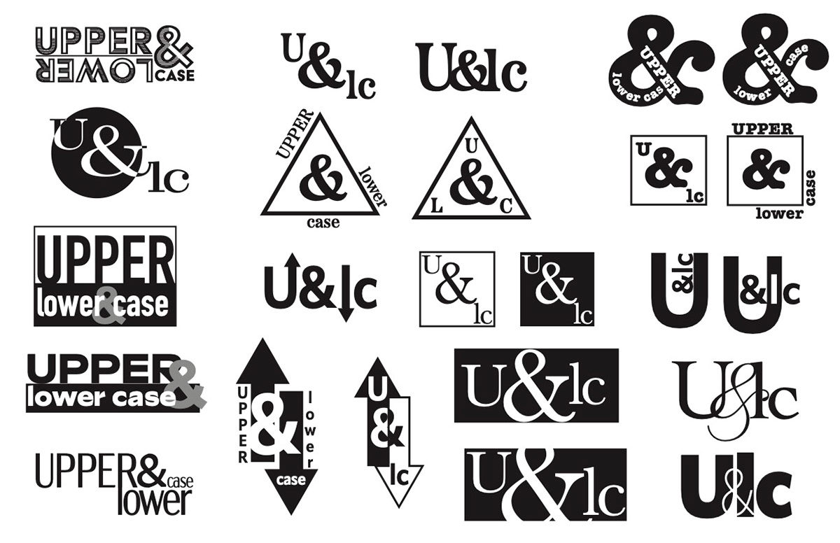
Logo Development: Beginning with sketches, I played with placement of the ampersand and different typography personalities. I further developed four options for the logo: one being an updated twist on the original logo; another more minimalist and modern; a third with a beautiful ampersand with good flow; and a fourth "wildcard," a little more funky but with an interesting play on the words "upper" and "lower."
The final choice for the logo was number one, feeling like an updated version of the original without straying too far from the recognizable U&LC emblem of the past. A vote from my peers in the class confirmed my choice as being the most fitting for the
theme of time warping.
The final choice for the logo was number one, feeling like an updated version of the original without straying too far from the recognizable U&LC emblem of the past. A vote from my peers in the class confirmed my choice as being the most fitting for the
theme of time warping.
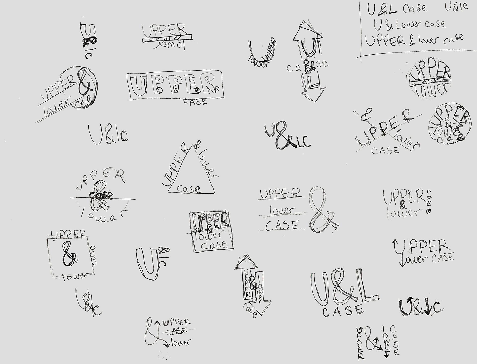
Initial logo sketches
Digital Logo sketches
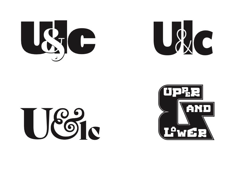
Final four selections for logo
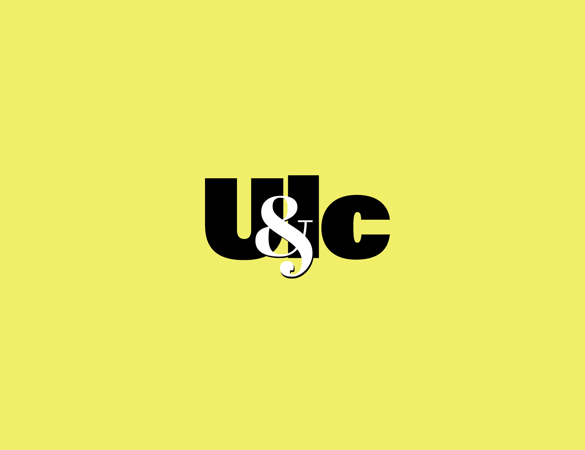
Final logo
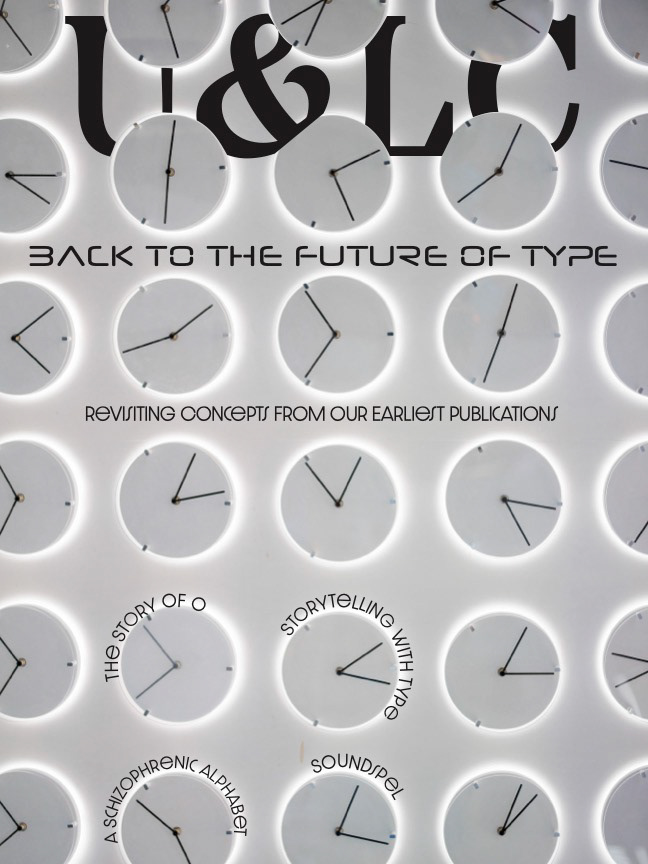
Cover Development: I decided which original articles I wanted to pay homage to, and developed four different version of what the cover could look like, experimenting with a futuristic theme and different colors and placements of the logo & text.
The final design for the cover used the image that felt more magical-time-travel and less science-fiction. I used Photoshop to enhance the glow on the light path, then added that effect to the rest of the typography in InDesign, even adding a little glow to the ampersand in the logo. I decided that my cover story would be The Story of 0, and highlighted all of the O's in the copy as a hint of what was to come in the issue.
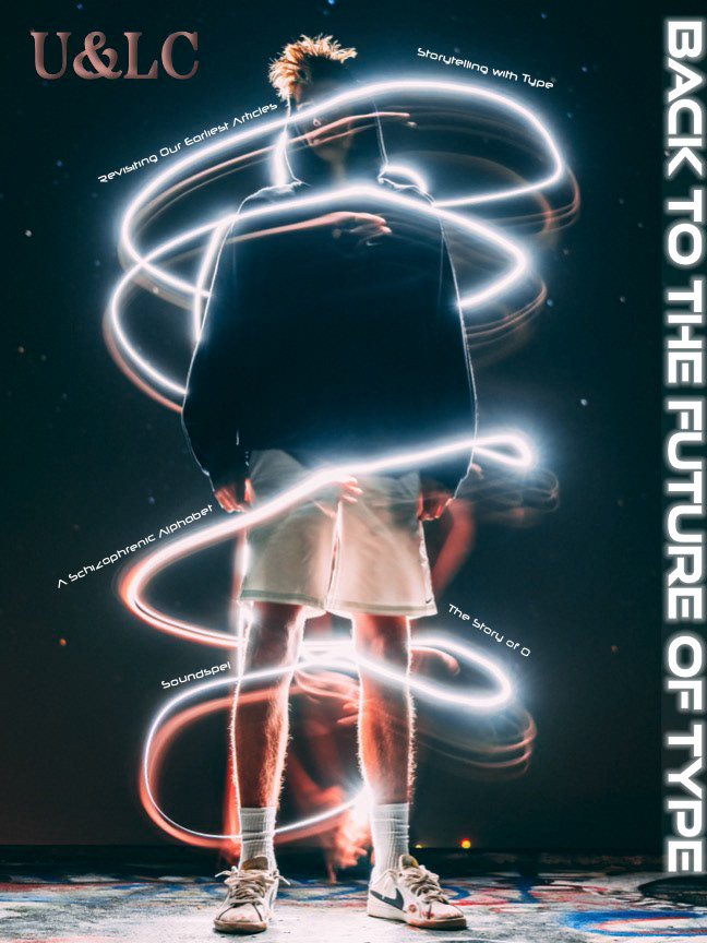
Cover roughs
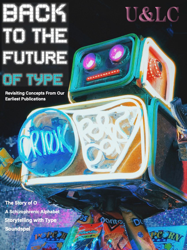
Cover roughs
Cover roughs
Cover roughs
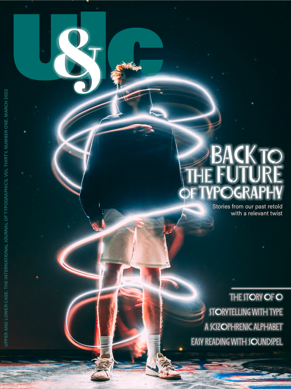
Final Cover Design
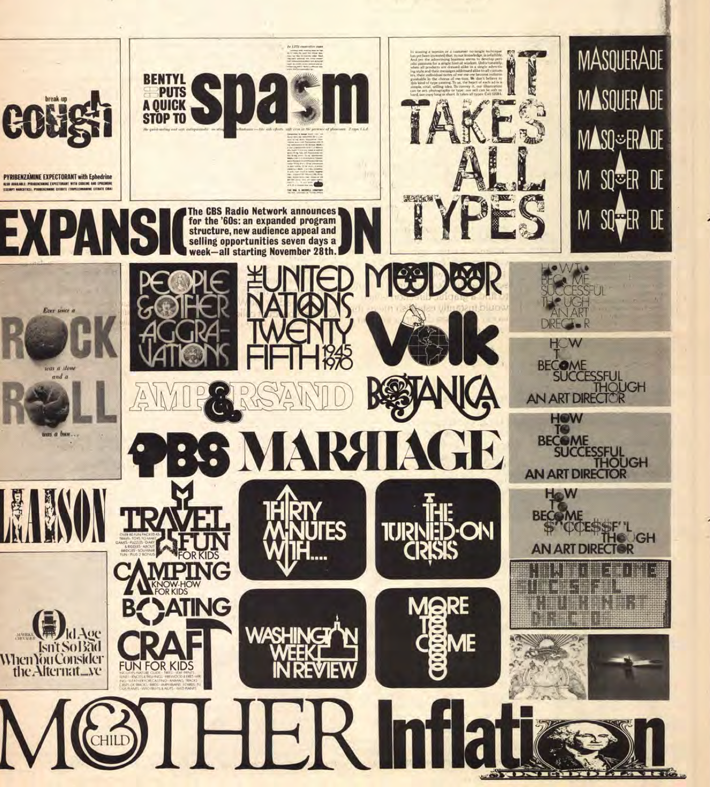
The Story of O: "I decided to become the first designer to not only fill the "O" with every conceivable round graphic symbol, but to exploit the characters of all the letters of the alphabet with the goal to replace them, whenever the occasion arose, with a symbol reflecting the nature of the character."
The Story of "O" is an article about how Herb Lubalin got his start in the design world by replacing letters with objects, the "O" being the first. He used a bottle cap to replace the "O" in the word TOPS for a Hires Root Beer ad. I wanted to pay homage to Lubalin's "O" by searching for images of round objects that I could incorporate into the layout of the article to draw readers in and help tell the story.
The final design simplified on earlier iterations that wanted to include all the things. The size of the flower and the text wrapping around it demands attention from the readers, and the circular images fit in well with the story, including Lubalin's original Hires bottle cap in the title.
Original "Story of O" article
Original "Story of O" article
"O" roughs
"O" roughs
"O" roughs
"O" roughs
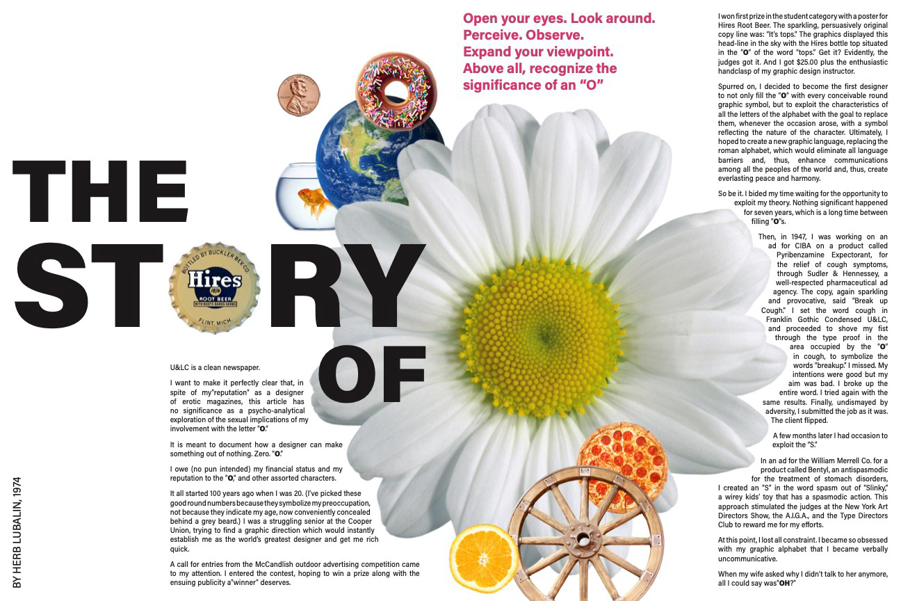
"O" Final Spread
The Schizophrenic Alphabet: A mashup of illustration and typography, highlighting the work of 26 different artists, each of whom produced a different letter for the alphabet.
In creating an updated version of this piece, I searched "Alphabet illustration" on Instagram, and discovered an amazing project of a very similar spirit. "36 Days of Type" asks artists to create one letter & number every day for 36 days, and to post their incredible work.
Though iPhones did not exist when the original article was published, creative typography clearly did. This updated version of the article takes the subject matter from the past and brings it to the present- changing the copy to include information about the 36 Days of Type challenge and incorporating my updated logo.

"Alphabet" original article

"Alphabet" original article
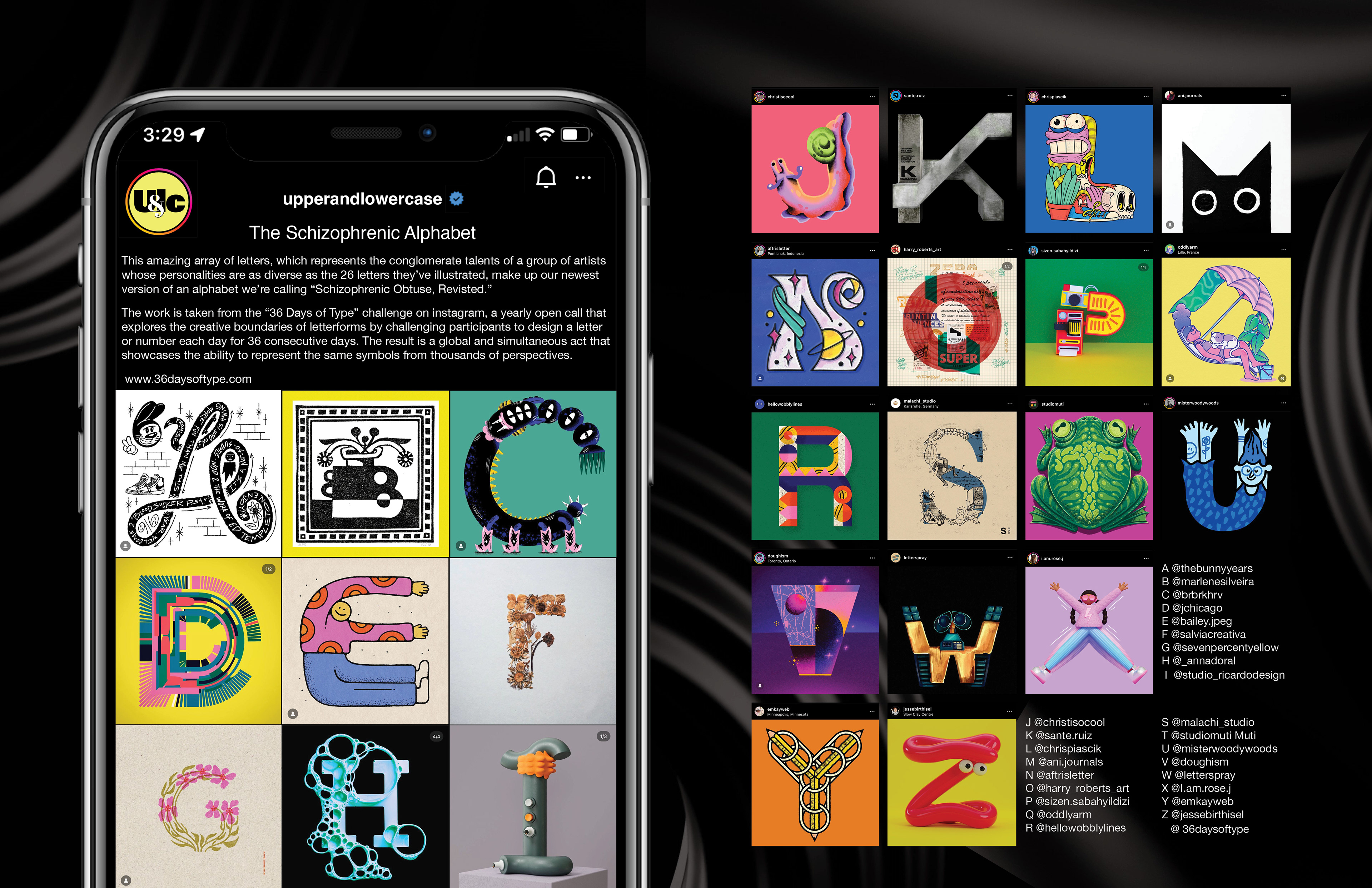
"Alphabet" final design
Reflections: In this project I got to take a deep dive into the past of design history. U&LC was such an interesting publication with incredible artwork, layouts, designs, & typography- based articles, and it was a fun challenge to imagine what it would look like brought into present day.
I created an updated logo which is versatile, modern, and still pays homage to the original. I then incorporated that logo into a magazine cover, created spreads based on articles of the past, and imagined what a web experience of the magazine would be in our new digital age.
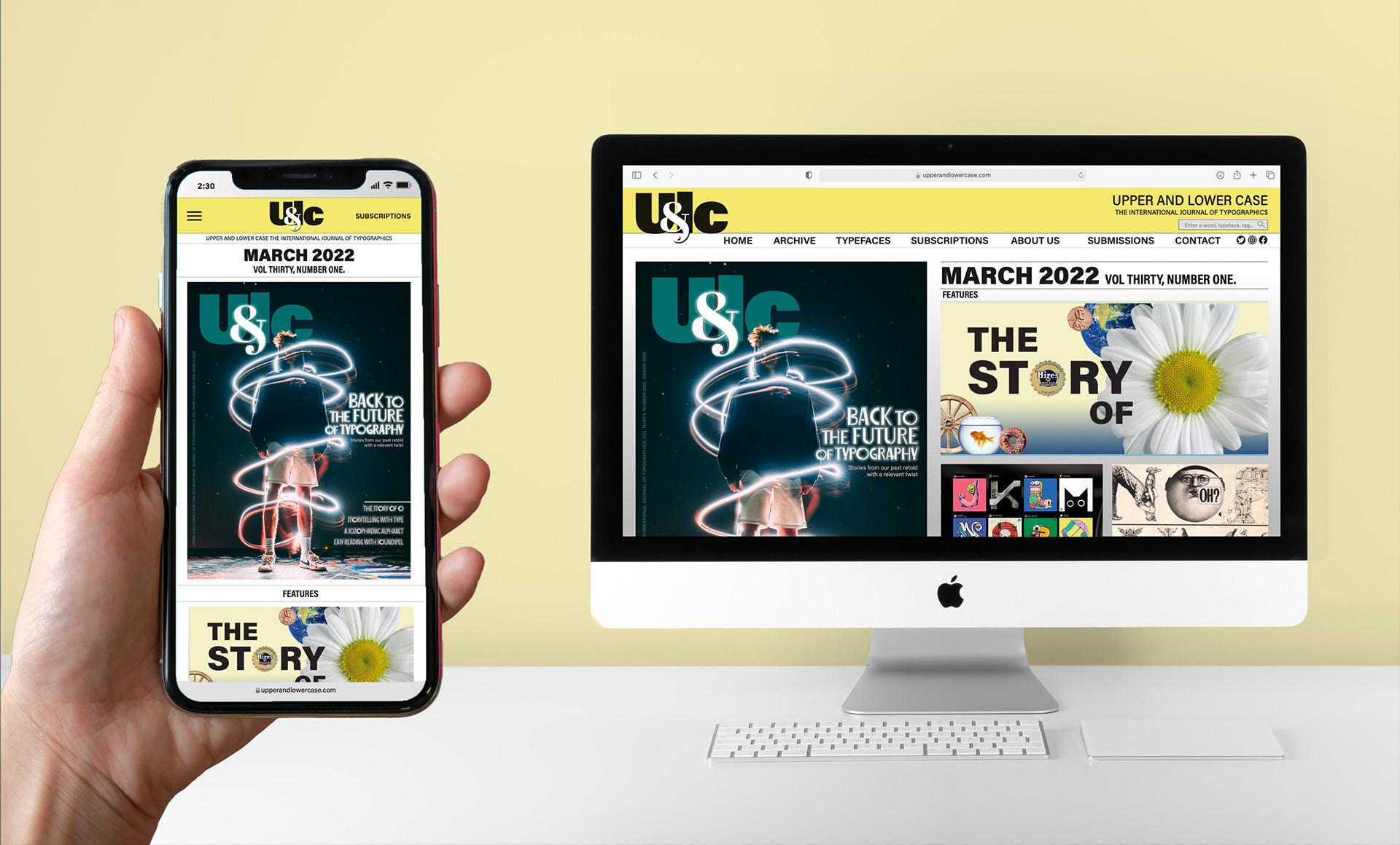
Web and mobile mockup