Brief: Create a new typeface! In this academic project, I designed two versions of a new decorative typeface. My first task was to research type inspiration, then sketch the letters "ADHESION" to act as building blocks for the rest of the alphabet. Using the Illustrator and the Glyphs app, I created two functional versions of a typeface- "Volcanic" and "Connection." I then created promotional posters for my work and a typography showcase event highlighting the type created by other students in my class.

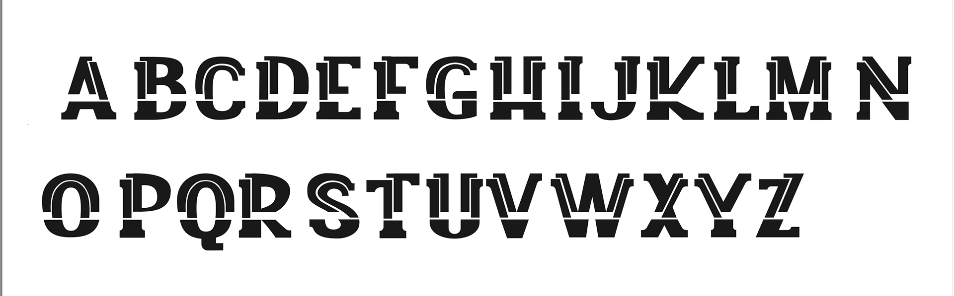
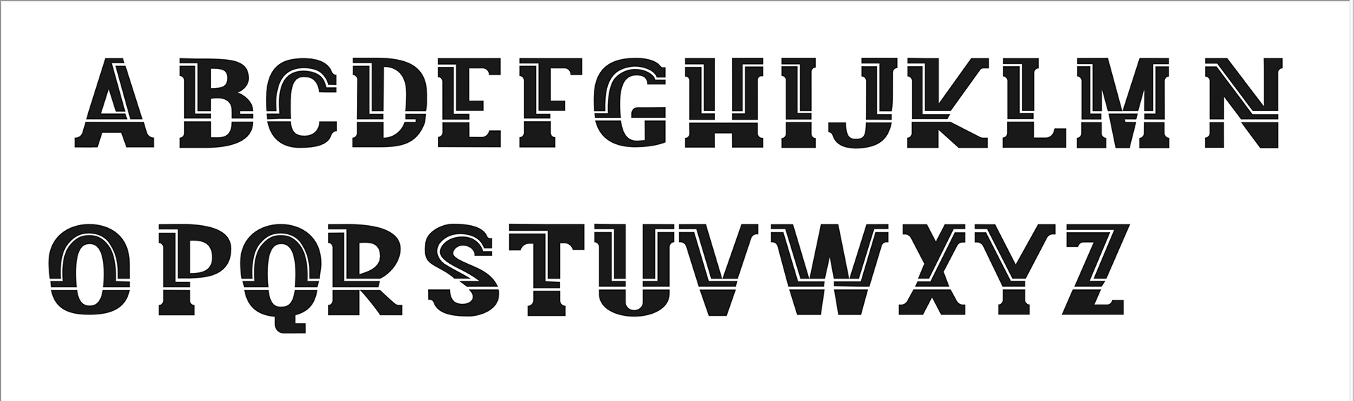
"Connection"
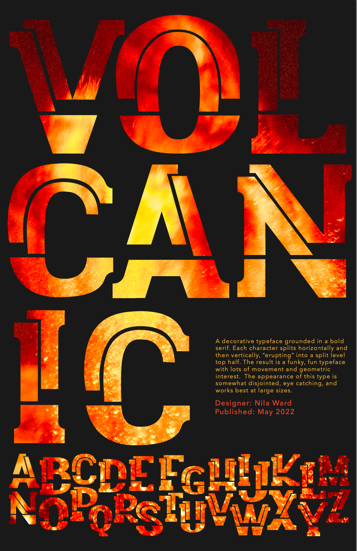
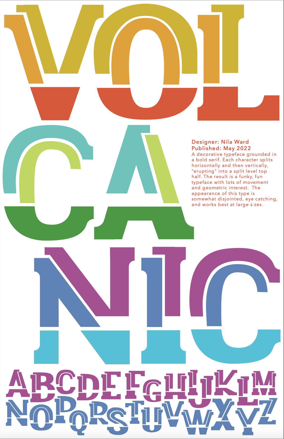
"Volcanic"

Volcanic poster version 1
Volcanic poster version 2

Connection poster
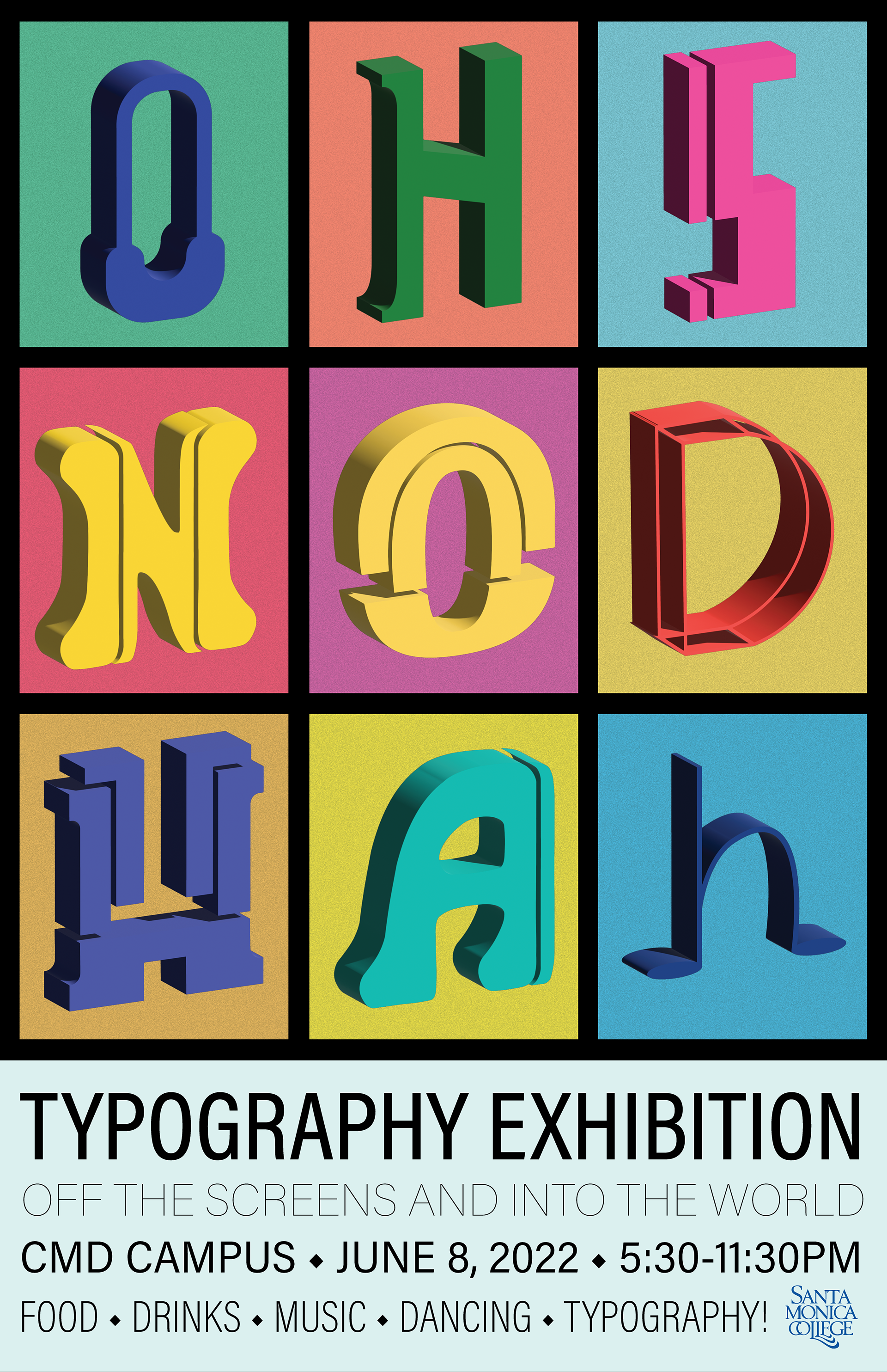
Exhibition Poster
Process
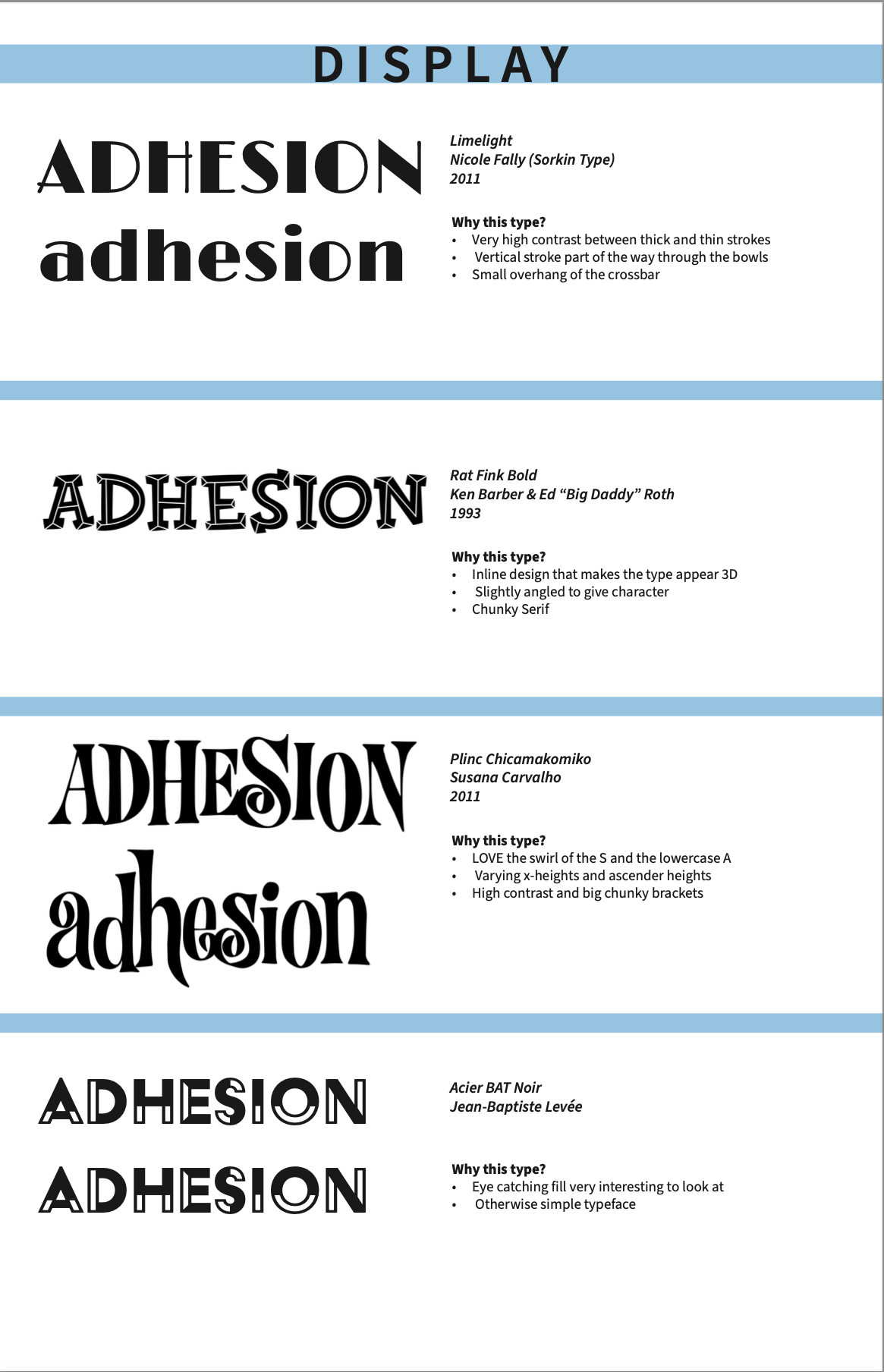
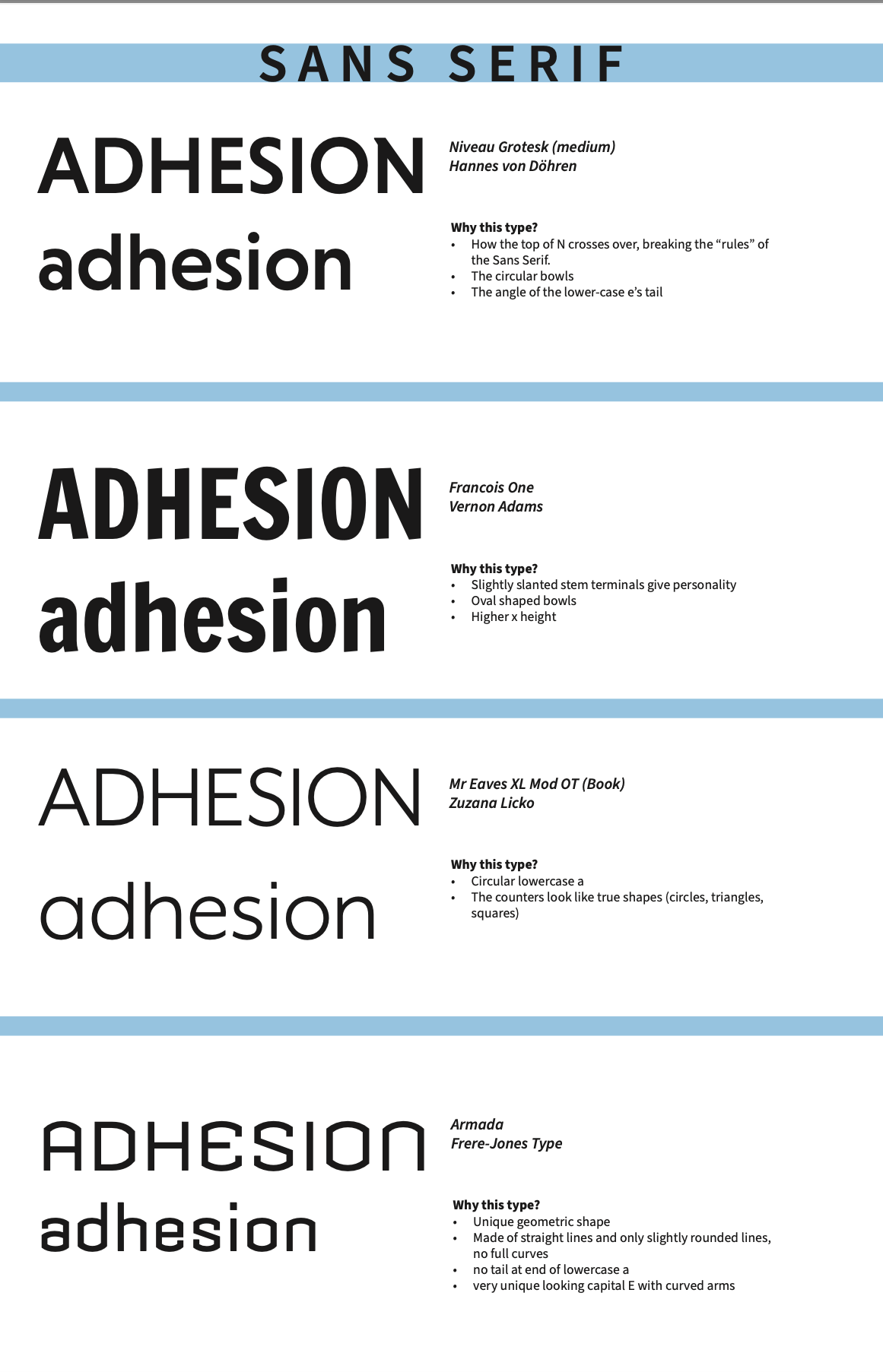
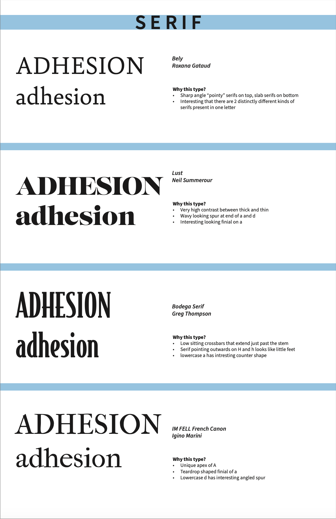
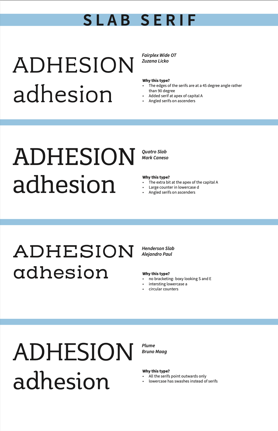
Mood boards: I looked at existing type for inspiration. I was attracted to bold typefaces with unique features, such as high contrast between strokes, inline designs, and an S with a good swirl.
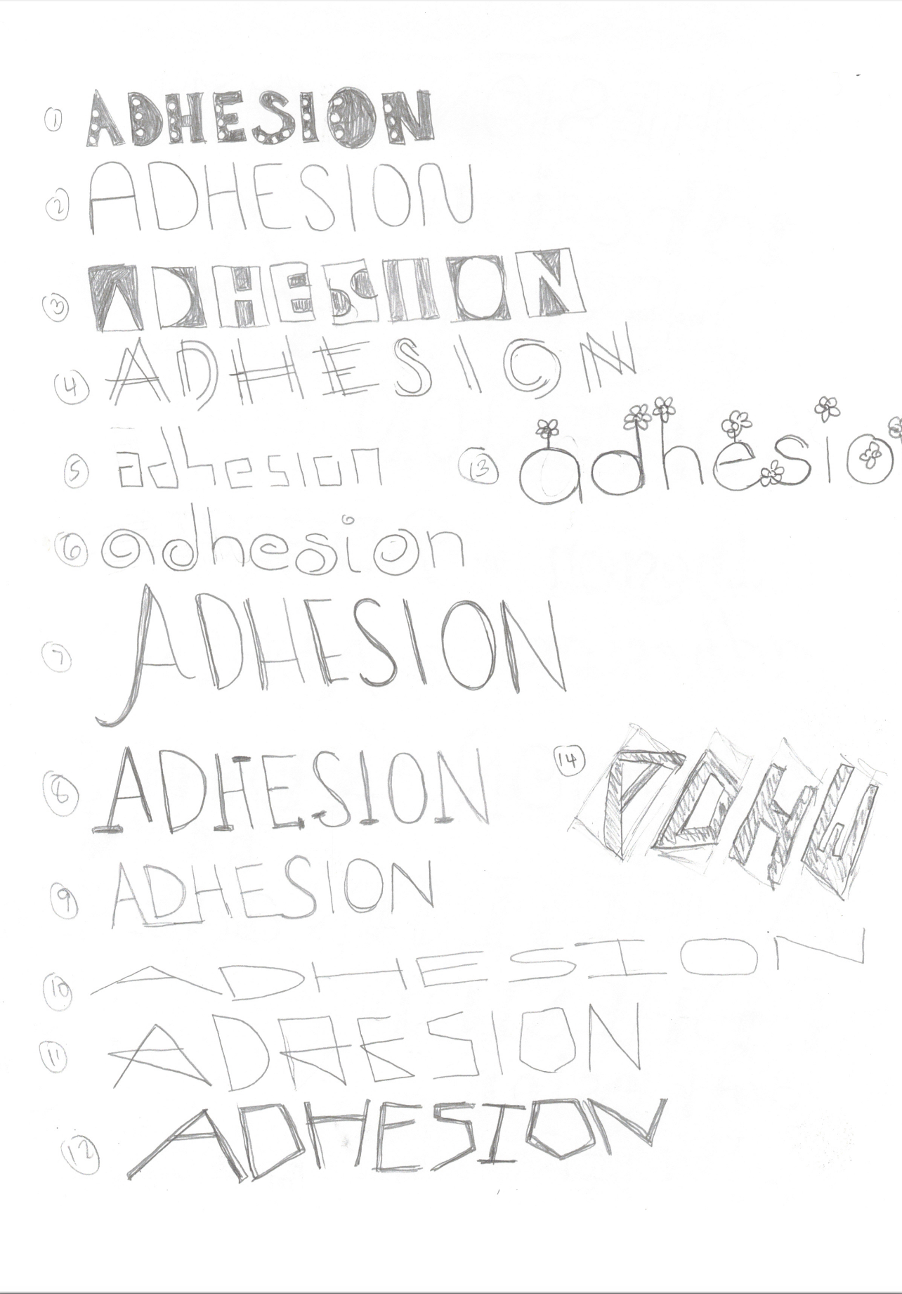
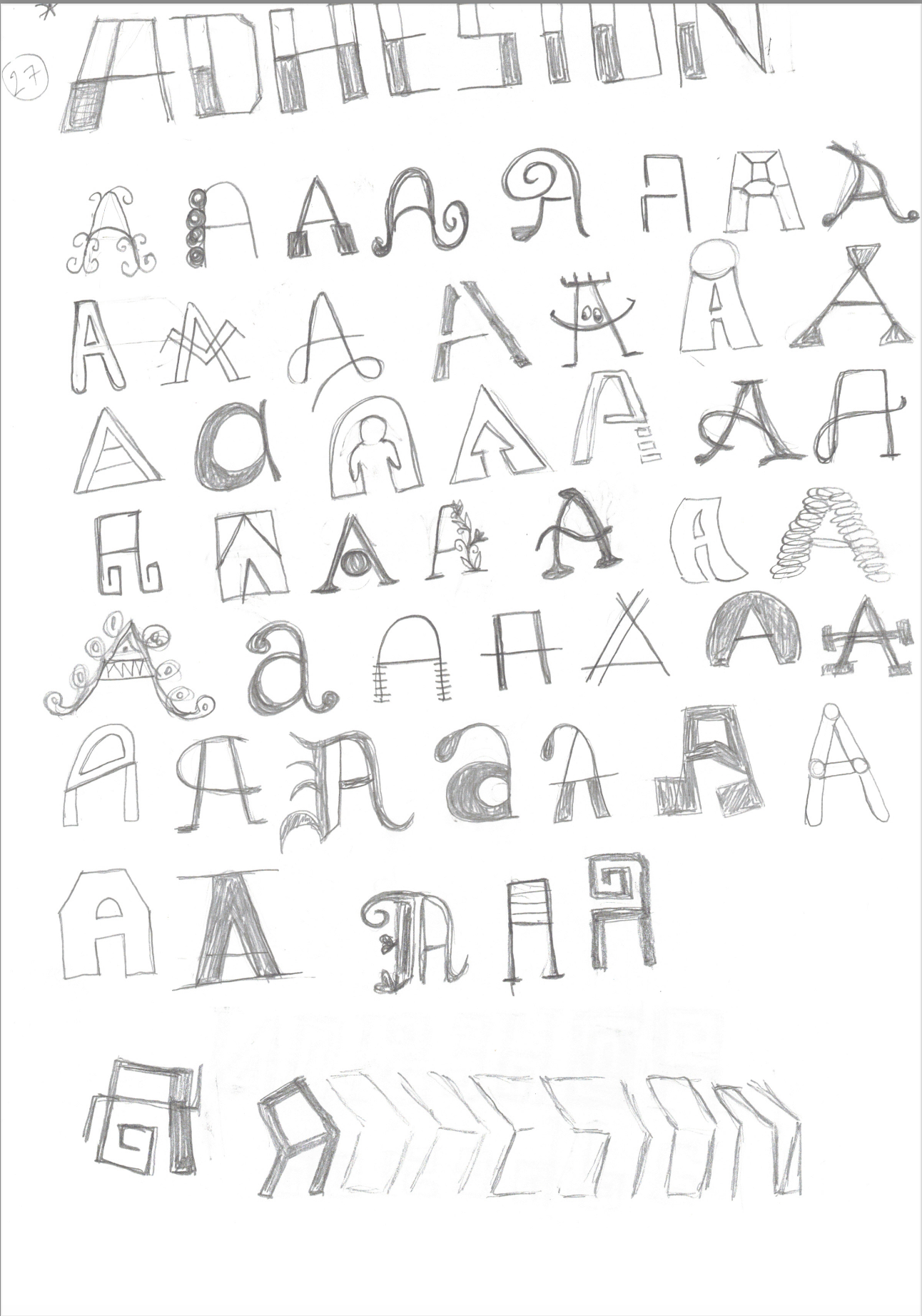
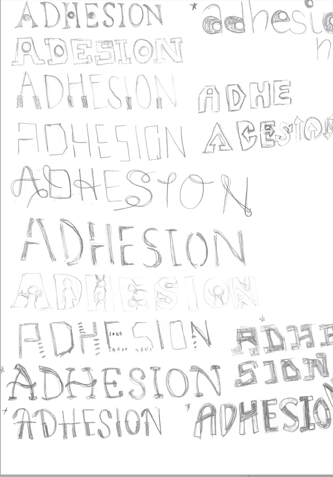
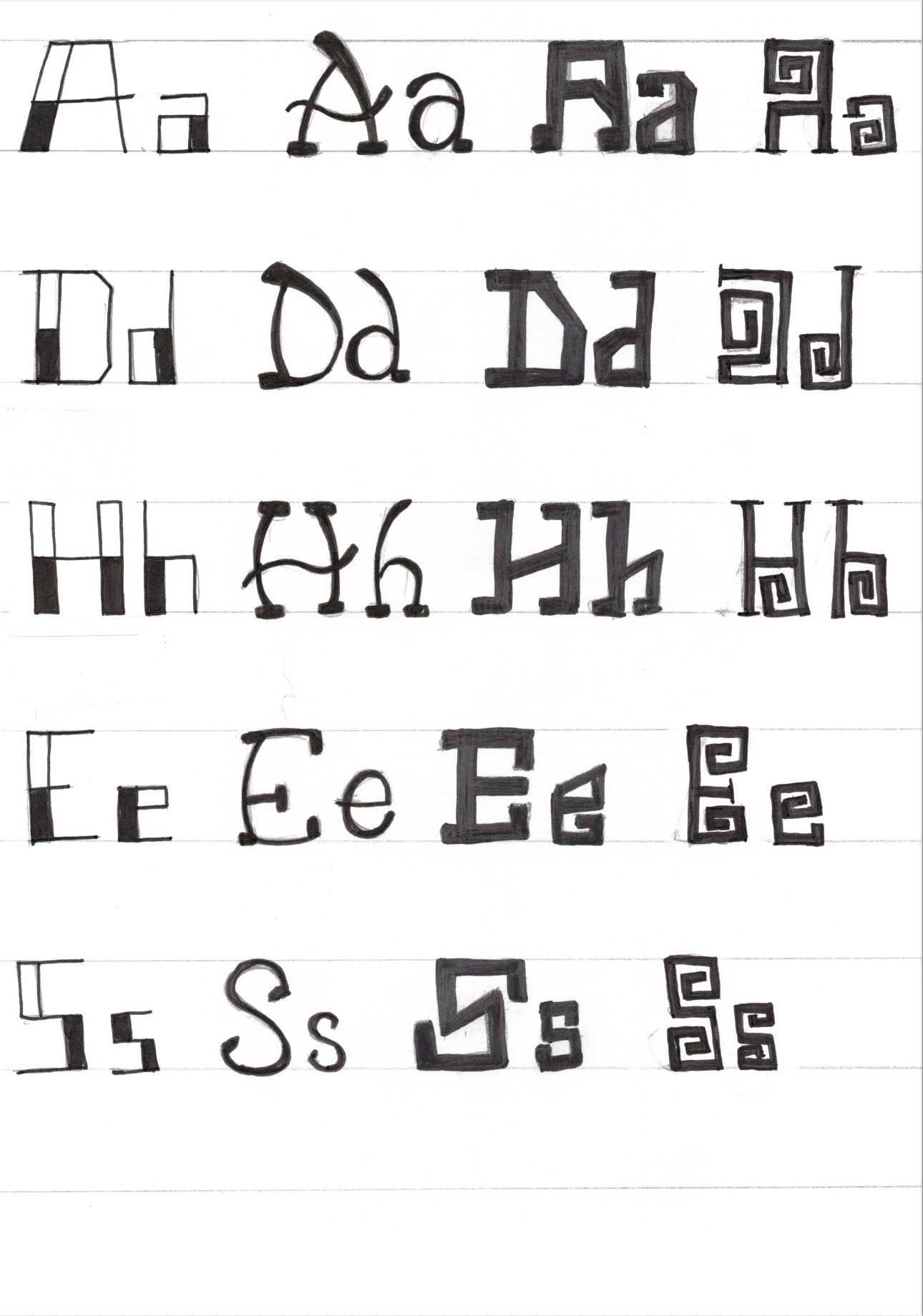
Sketches: Using the letters "ADHESION" as building blocks, I sketched a number of ideas for new type designs. It was fun to see how many different ways I could come up with to draw an "A."
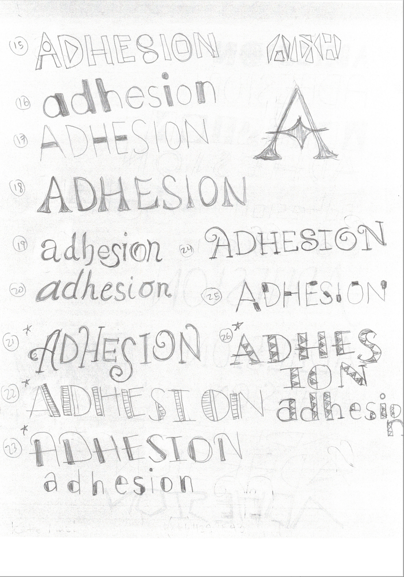
Secondary Sketches: From my brainstorming sketches I selected four different options to do more detailed sketches of. At this stage, I was still unsure if I wanted to create something more simple or elaborate. I was most attracted to the third one in the row, with the bold lines and asymmetrical angles.
Moving into the digital realm, I played with different stroke weights and curves until landing on a type that I liked. Wanting to create a more interesting display type, I sliced the type down the middle, manipulation and rotating the top half to create a first draft of the type that felt somewhat off kilter, like the letters were in a balancing act.
Secondary sketches
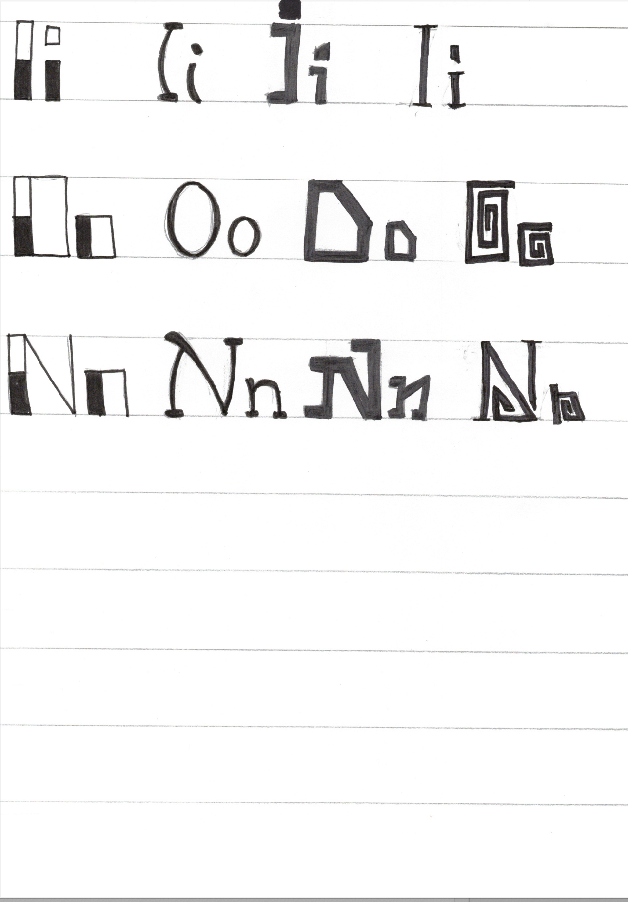
Secondary sketches
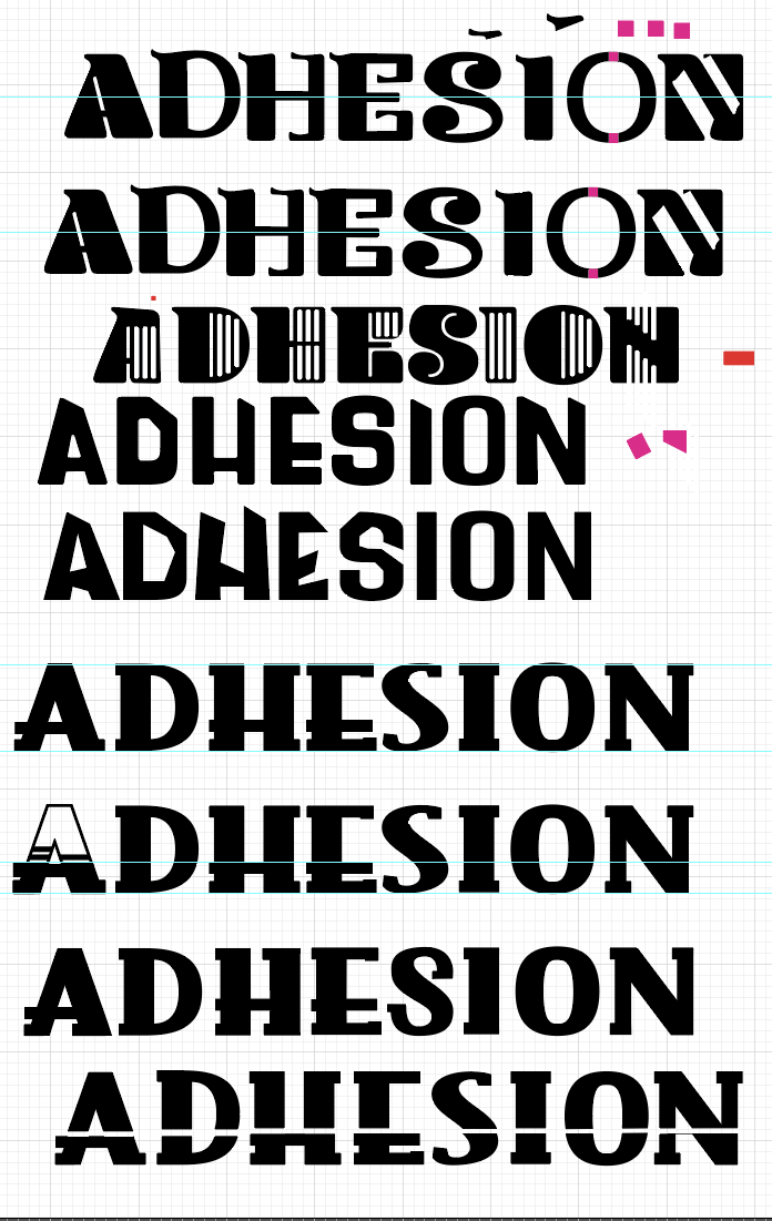
Digital sketches
First Draft
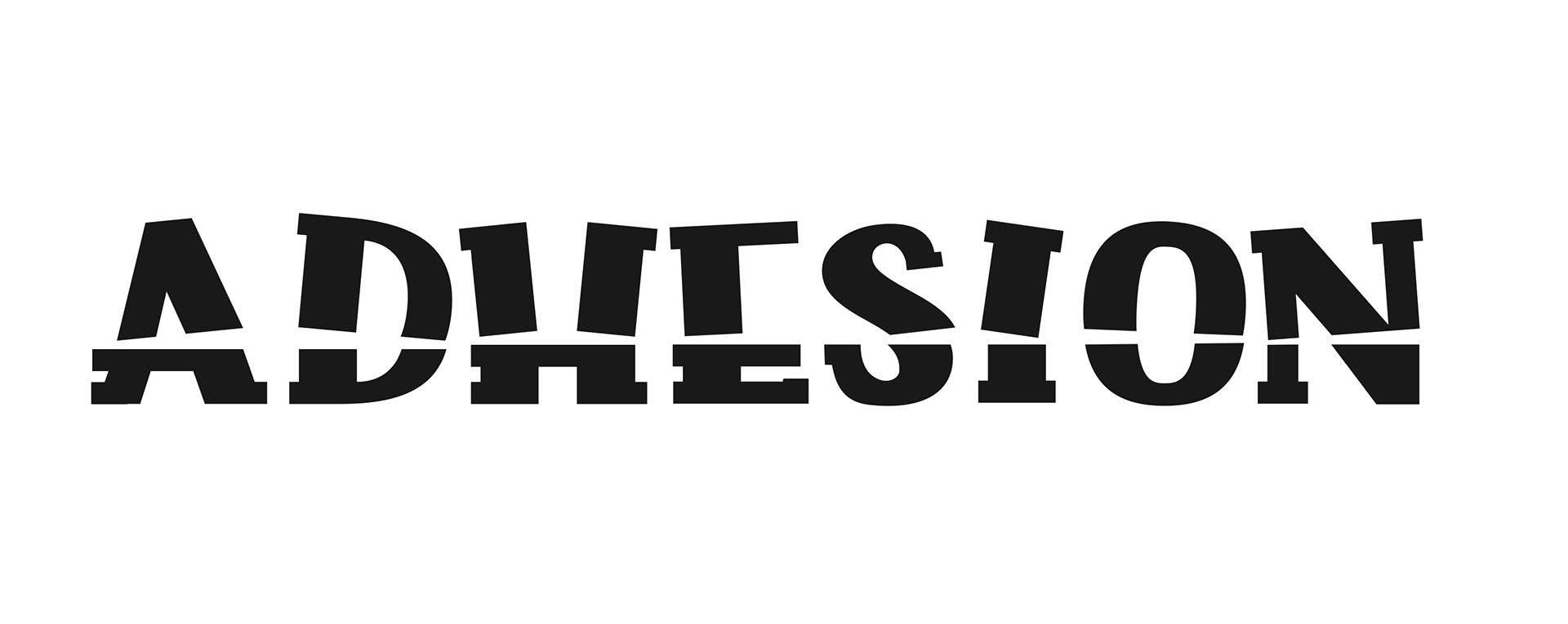
The final versions are similar, as they have the same base and style of in-line cutouts. I continued to live the letters in the first draft and add spaces that gave the letters more visual interest.
Volcanic felt like the of the letter were erupting from the base, and gave me a tropical vibe from the different levels stacked on top of each other like bamboo.

"Volcanic"
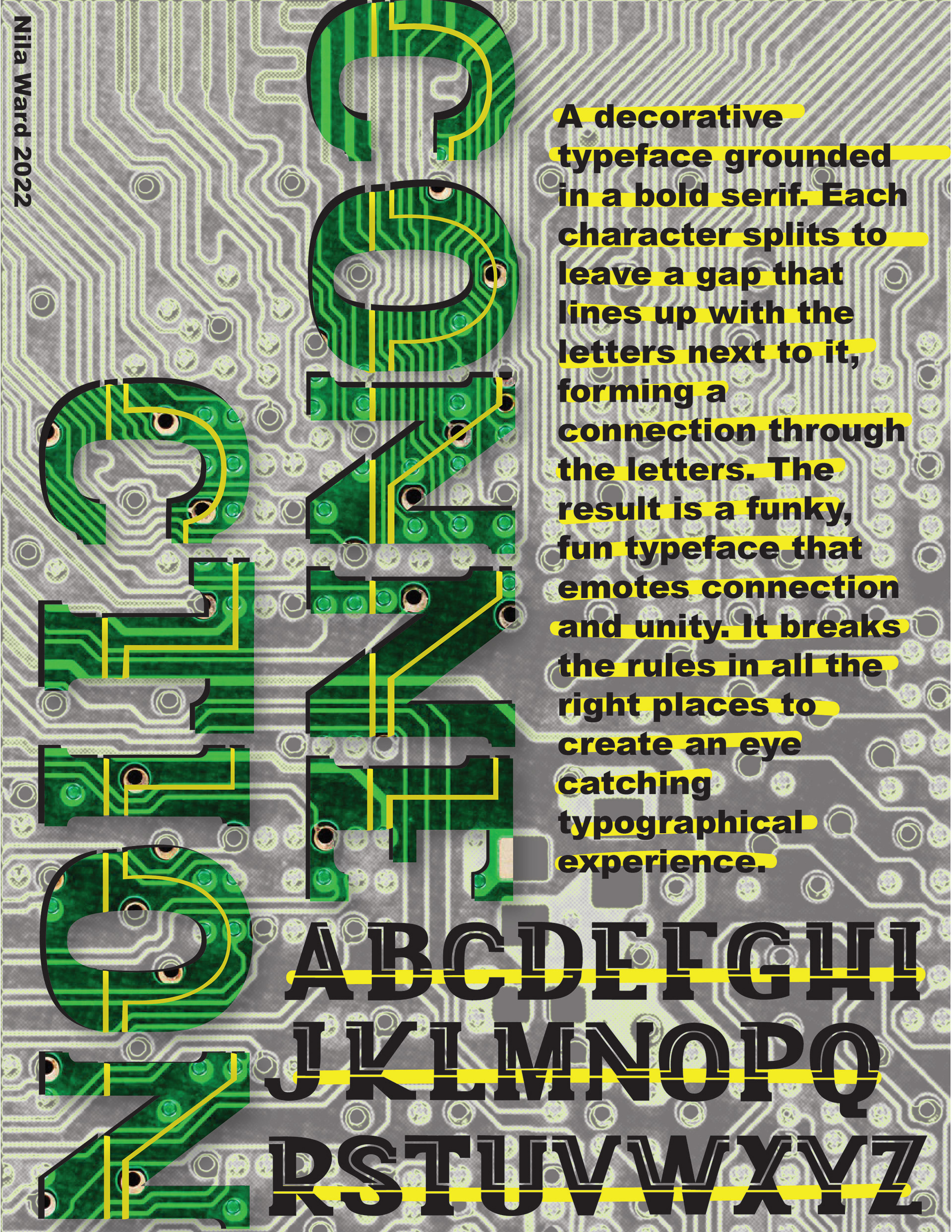
Connection reminded me of a circuit board, with different paths running through the letters but ultimately connecting one to another in a visual line.
"Connection"
Poster Process: I tried different masking techniques with in the creation of the poster, using a variety of volcano photos. The letters also lended themselves very well to color blocking, so I tried different combinations of colors that would sell the font's versatility.
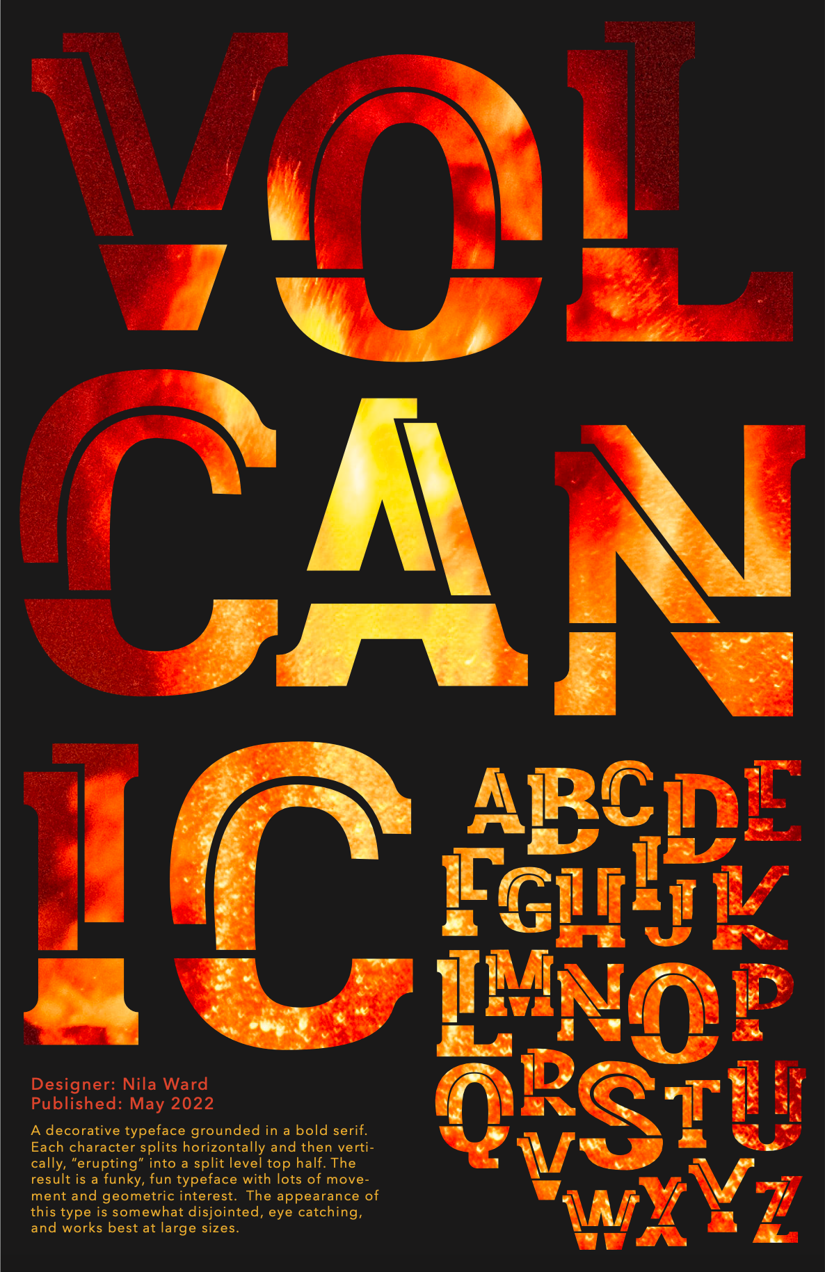
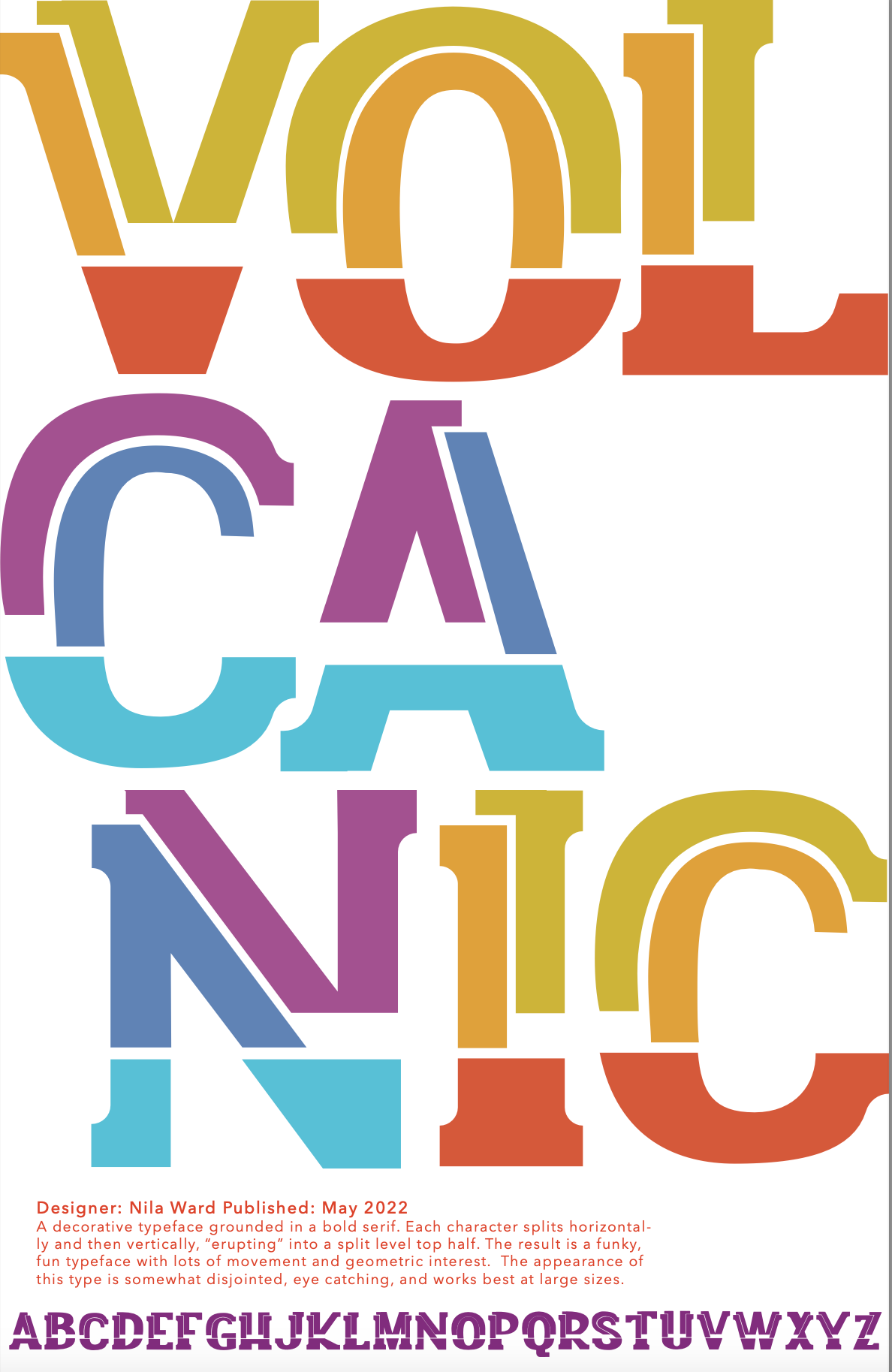
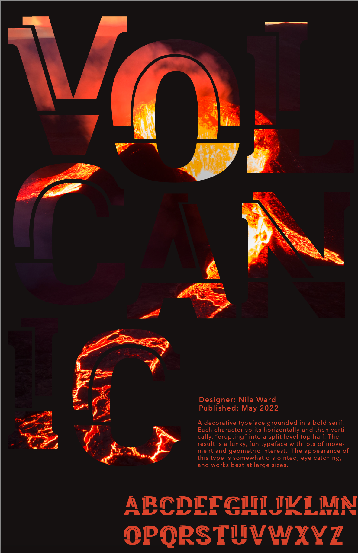
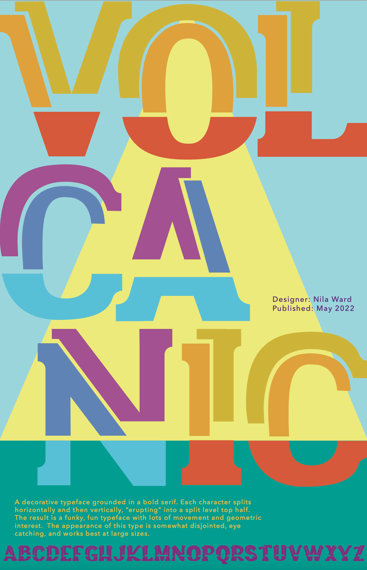
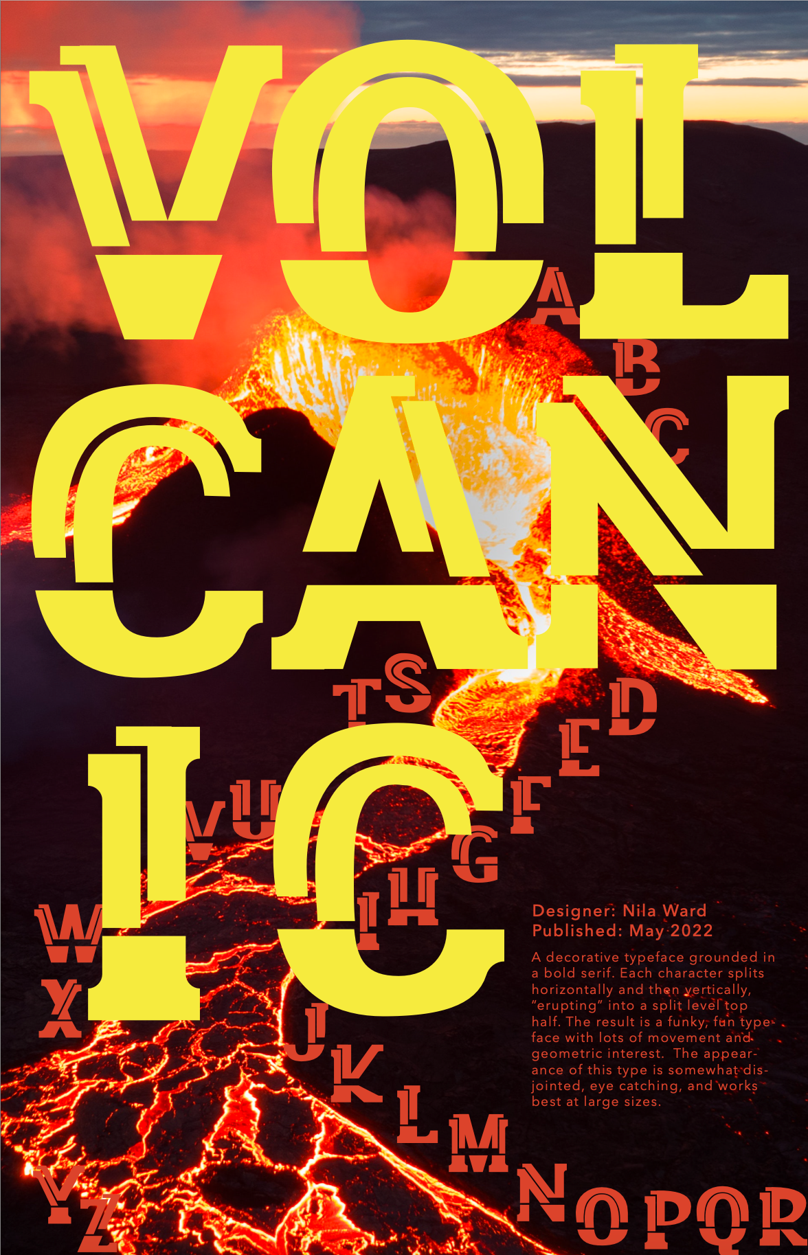
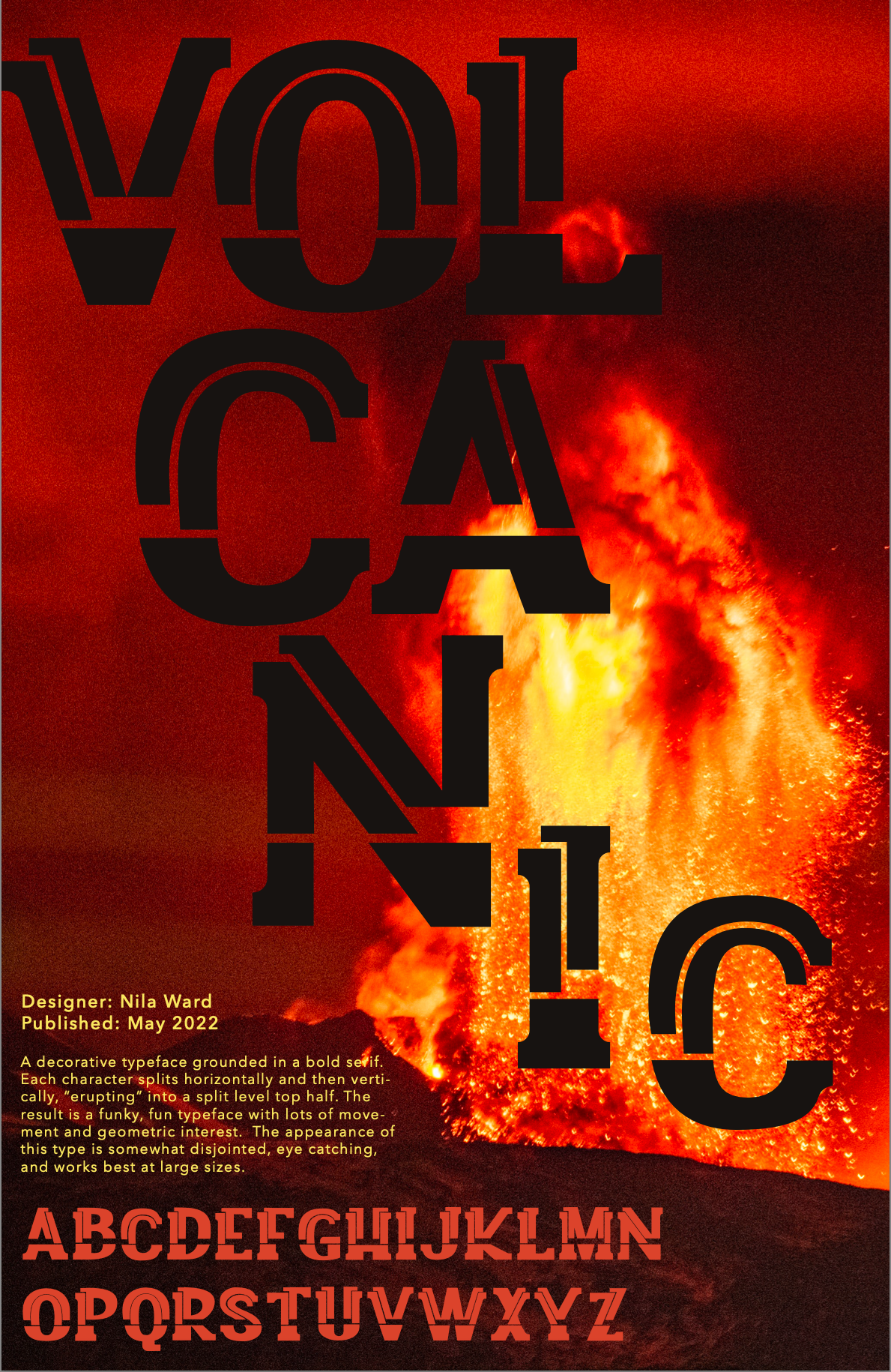
I ultimately created two final versions of the poster for "Volcanic," one with a more literal visual of a volcano erupting, and the other with color blocking in a tropical- feeling color palette. Two different takes on advertising the same font.

Final Volcanic Posters
Final Volcanic Posters
For the "Connection" poster, I expanded on the name of the font by including visuals of a circuit board, highlighting the connections between the letters. This was a fun poster to make, playing with different masking and highlighting techniques.
The final task was to create an exhibition poster using typefaces that other students in the class has created. Using a 3D effect and color blocking, I was able to highlight the unique features of different student's work while bringing them
together into one cohesive image.
together into one cohesive image.
Connection Poster

Exhibition Poster
Reflection: This project was a fun exploration of how type is created and gave me a much deeper appreciation for the typography that we use every day as designers. It was interesting not only to think about the construction of how type is made but also its usage and the appropriate spaces to use different fonts. I designed two versions of a new decorative typeface that would be best used at large sizes to help make a statement. Their versatility lies in the segmentation of the different pieces of the type, because they can be used in interesting ways with different color combinations, as well as work in a solid color. Next time, it would be interesting to create a more subtle typeface so that I could work on finding the small details that would make one type stand out from the others at a more usable level.