The Brief: In this academic group project, we met a real client with a small business in Seal Beach, CA. She was looking for a complete rebranding for her toy shop, Knock Knock Toys & Gifts. Our team of 3 designers proposed a new logo, marketing, merchandise, web, social media, and a storefront uplift.
Role: Project Lead & Graphic Designer- Responsible for the logo, illustrations, and deliverables including the brochure, birthday postcard, storefront redesign proposal, & window display examples.
Tools: Adobe Illustrator, Photoshop, Indesign
Problem: The existing logo is cute, but the text over the seal illustration is hard to read. It plays heavily into the location (seal beach), but not the joking nature of the store name (knock knock).
Insights: Knock knock jokes are good, innocent punny fun, which is why kids love them so much. With a store name like knock knock. it seemed like there was a missed opportunity by not using knock knock jokes in the marketing strategy.
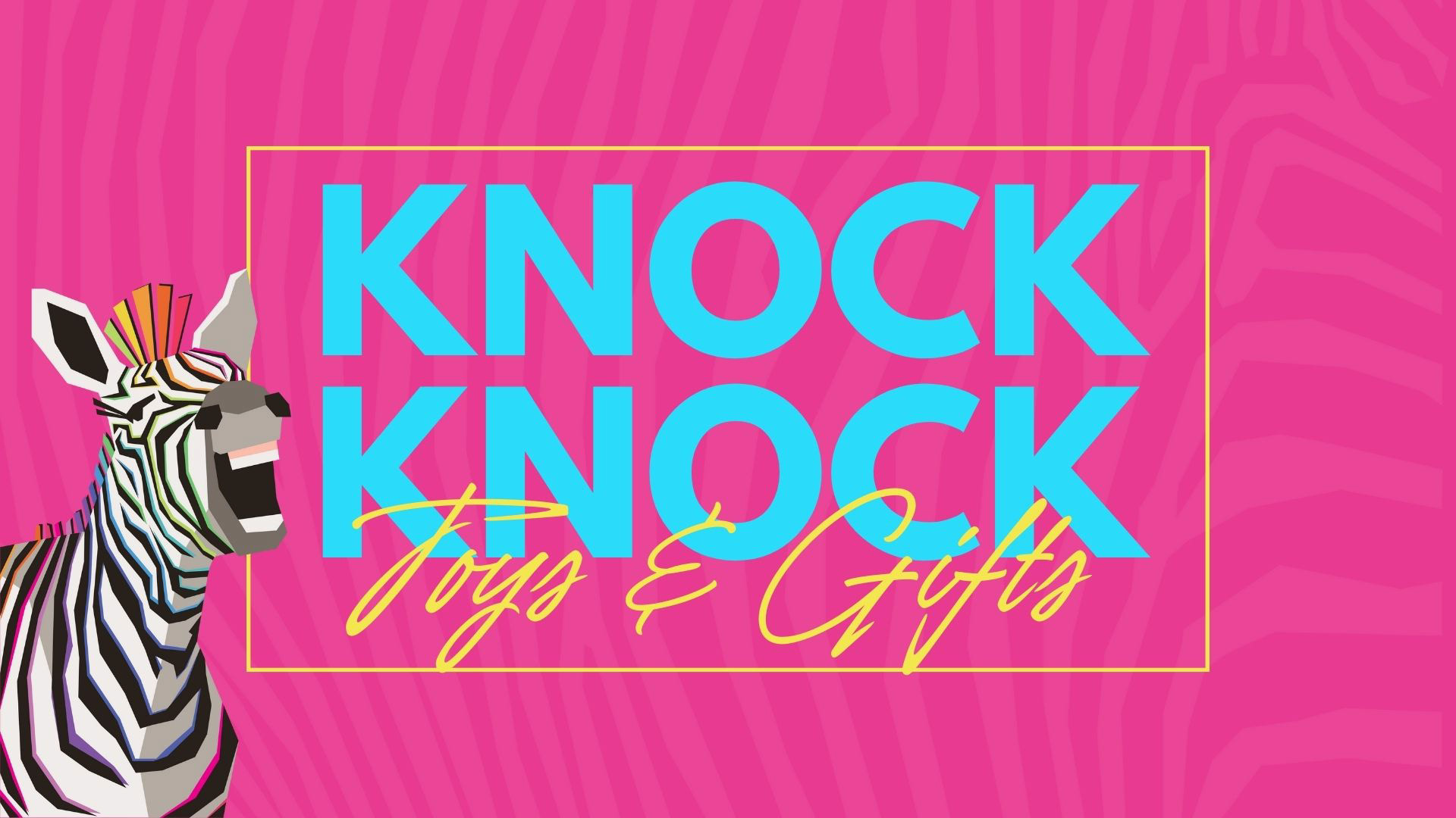
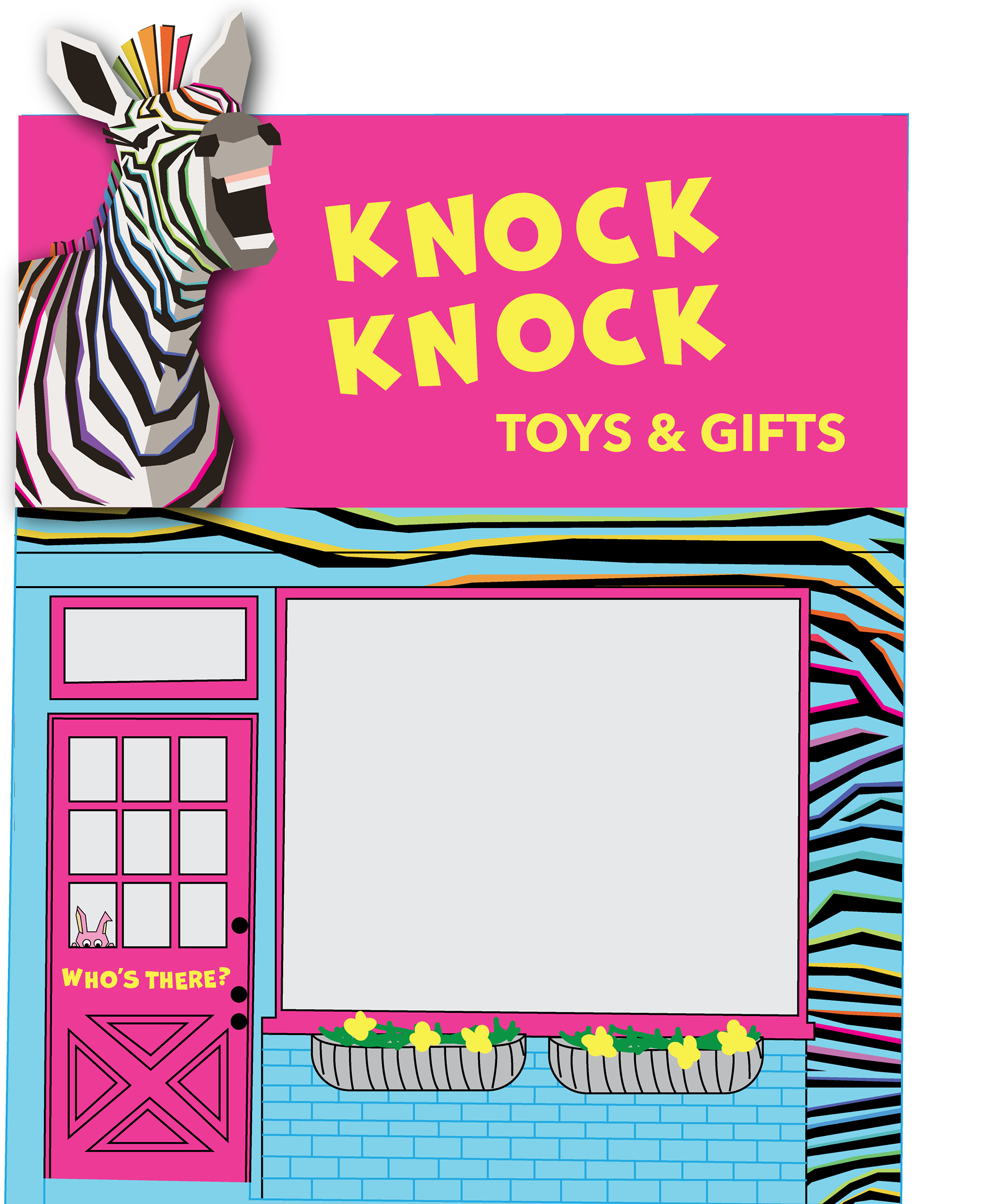
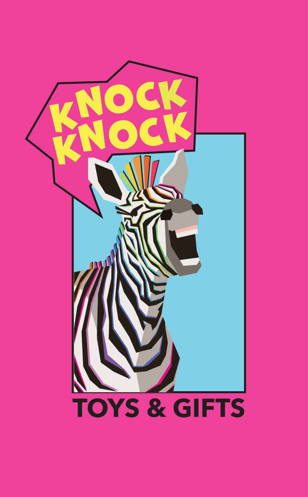
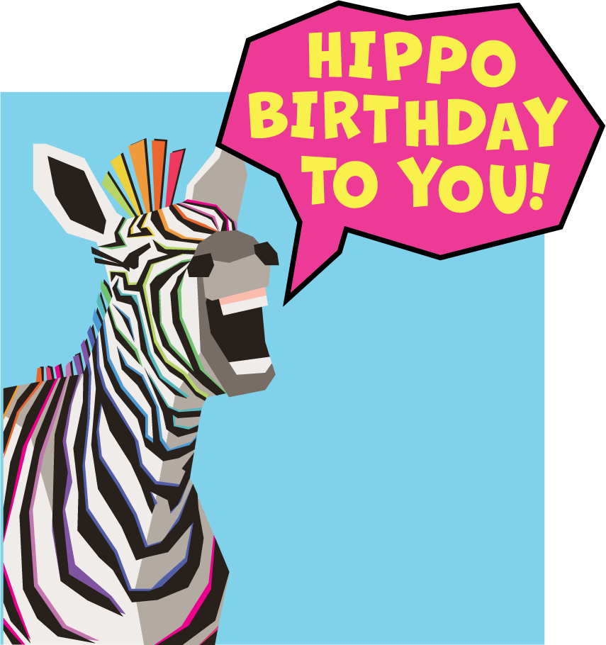
Solution: The creation of a new character that would tell knock knock jokes to the kids. This logo character is a zebra rather than a seal, to help the store gain a unique identity to the many seal-themed stores in the town.
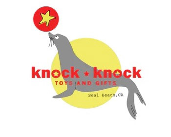
Original Logo
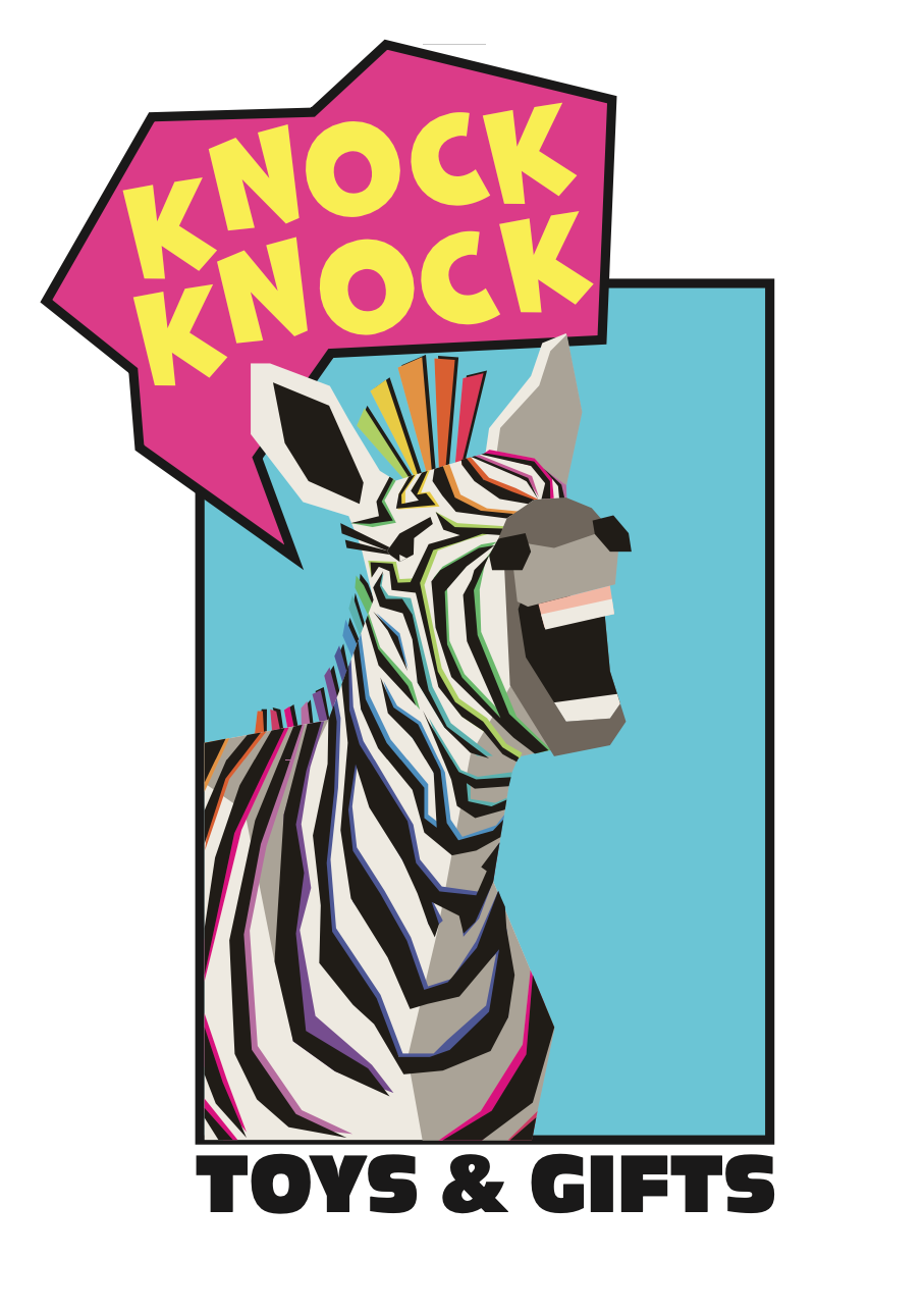
Redesigned Logo
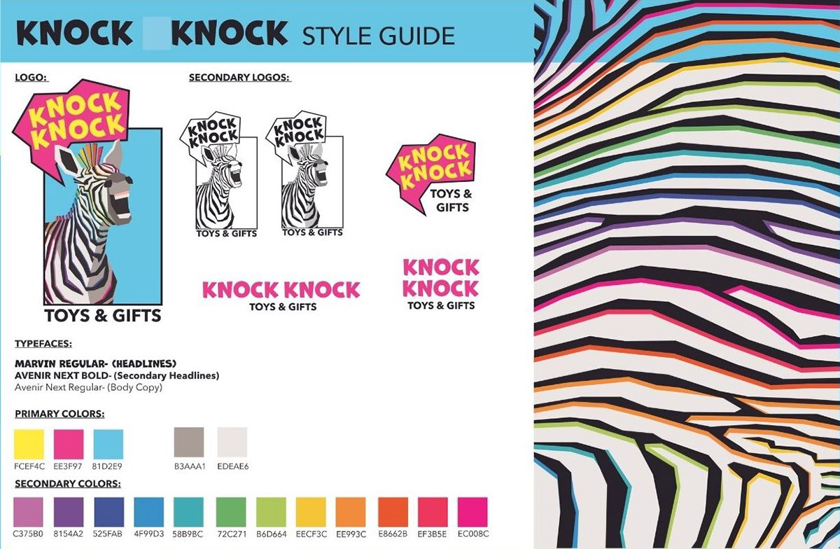
Style Guide
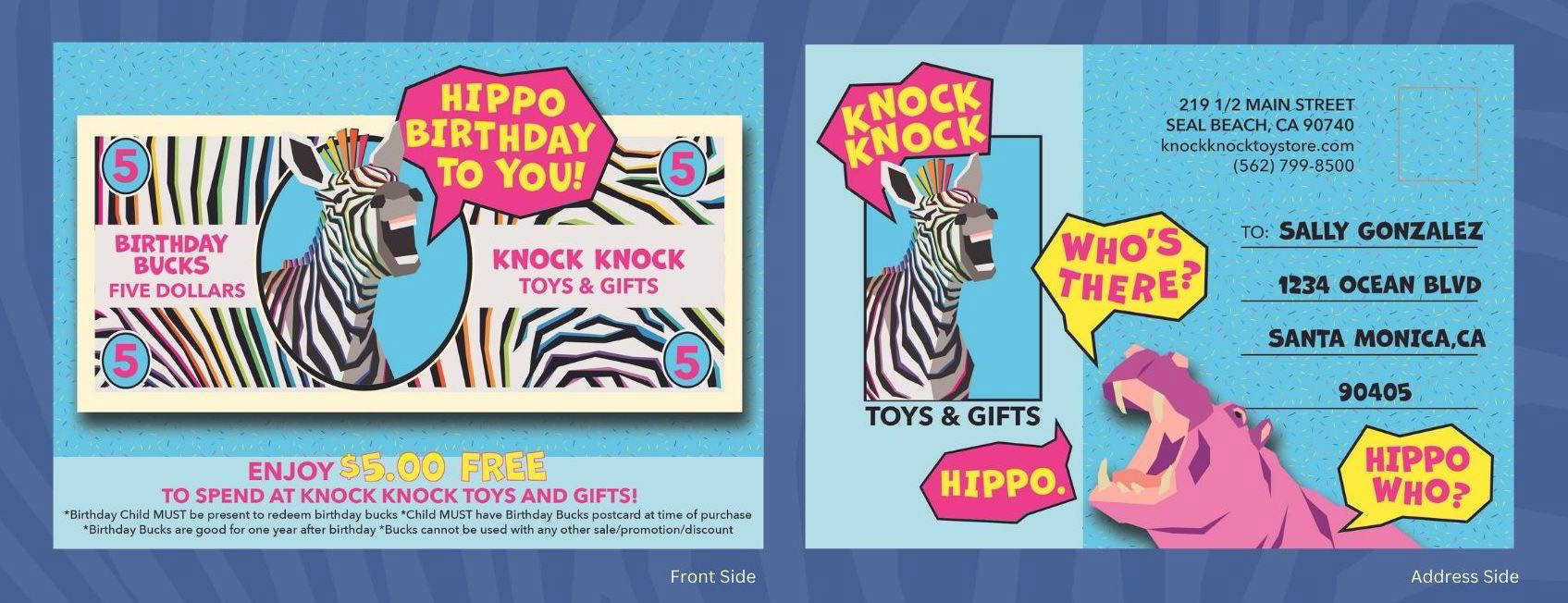
Birthday Postcard
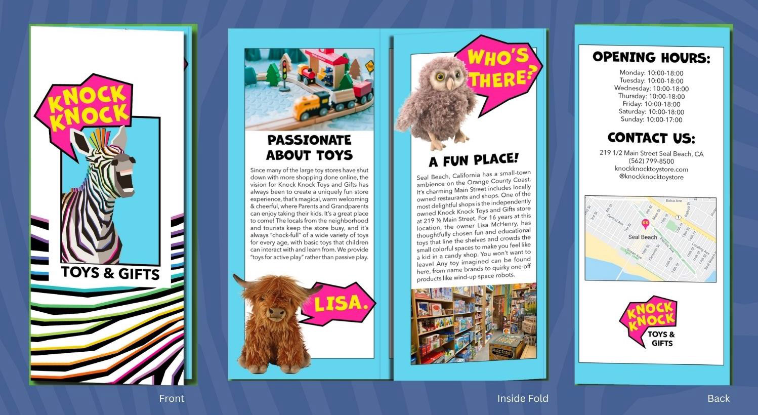
Brochure
Brochure
Storefront and window display mockup
Process
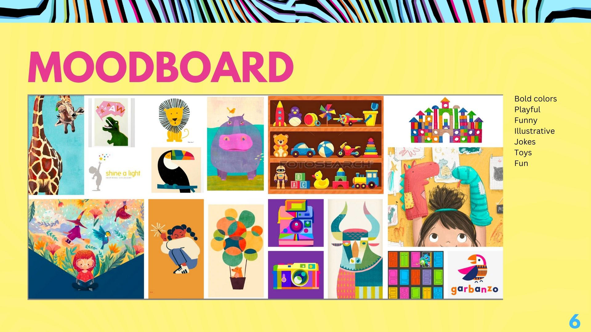
This was a collaborative effort in which each of the three team members proposed mood boards and logo designs to then be selected and revised based on group suggestions.
I initially explored 3 different directions for logo design: Knocking on a door, a more vintage toy store design, and a play on knock knock jokes. For the doors and the vintage logo ideas, I played with integrating the K's in knock knock. The zebra idea was a wildcard but I knew it may have the potential to give the store a unique identity.
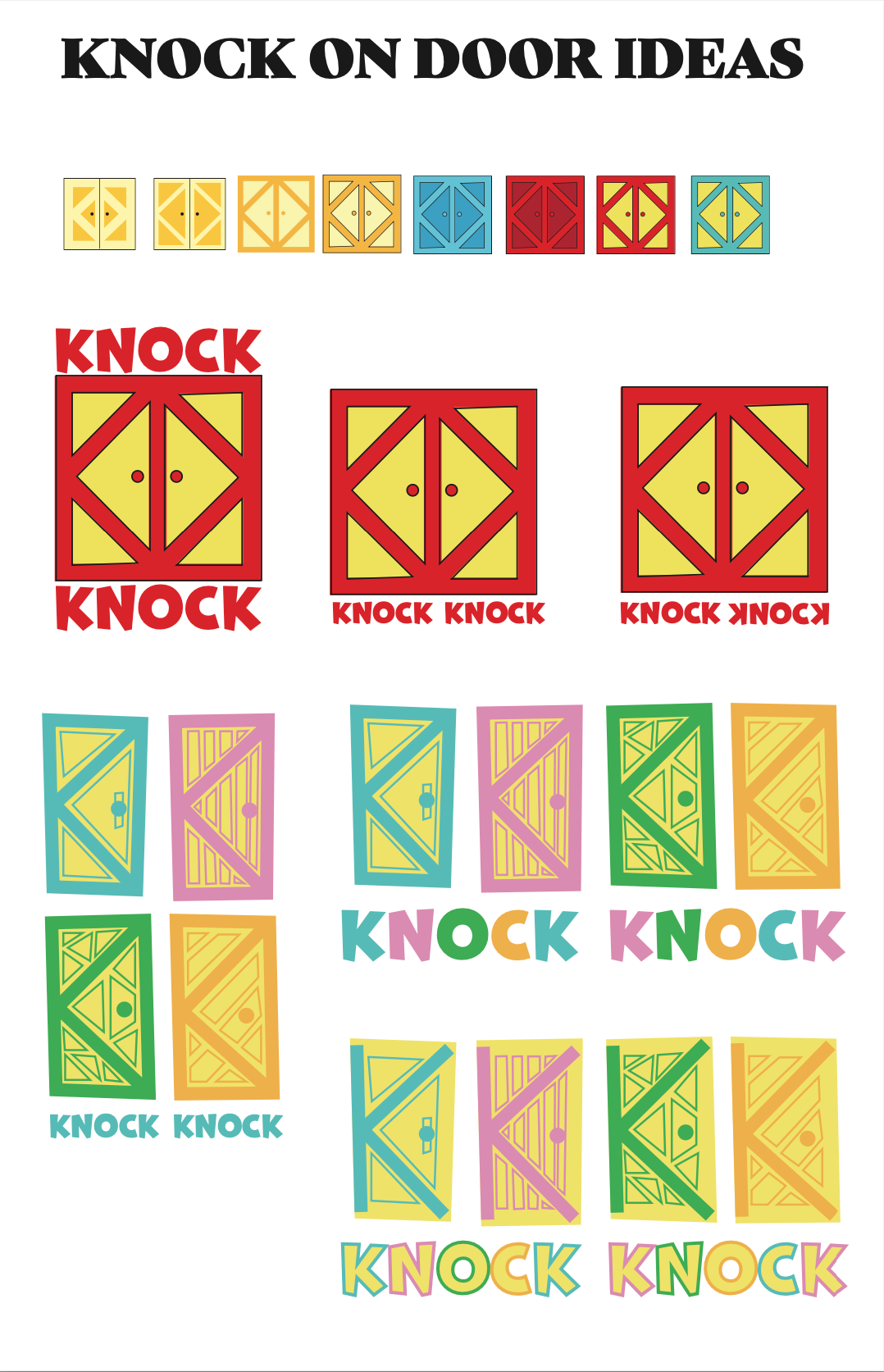
"Knock on door" sketches
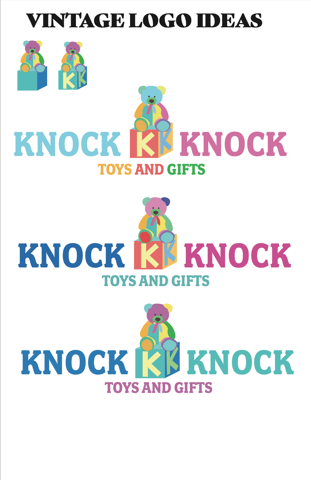
Vintage logo ideas
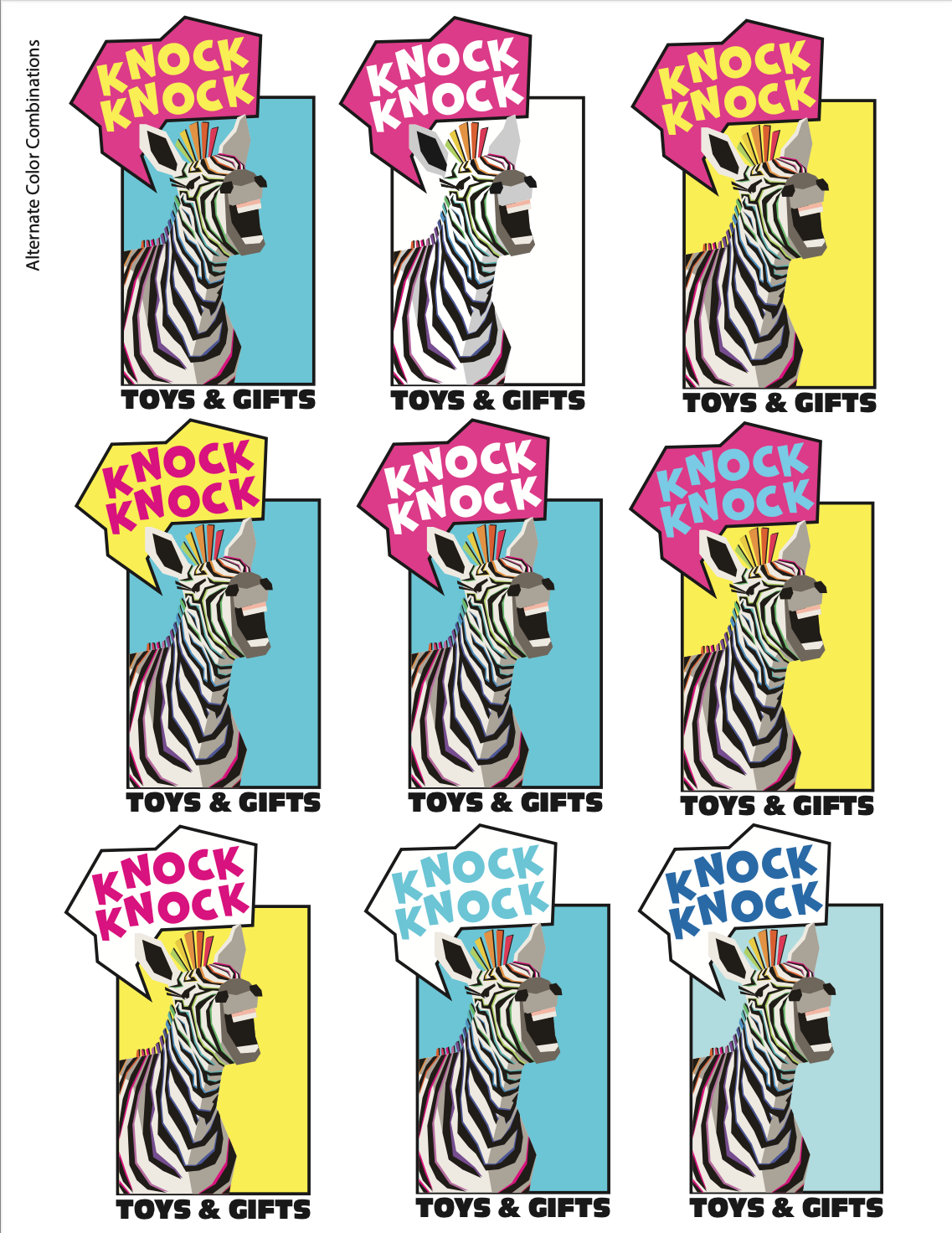
zebra logo initial iterations
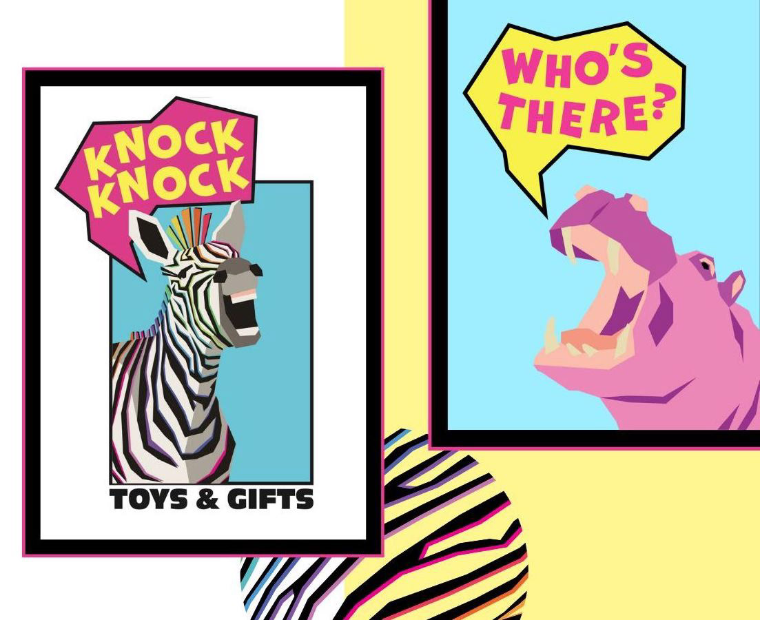
Each team member submitted their best versions of their logos to the group so that we could vote on our favorites. These are the logos that were not selected & the final logo selected (the zebra telling a knock knock joke.) We agreed that the zebra could act as a mascot for the store and the zebra print could be a recognizable feature in merchandising and marketing.
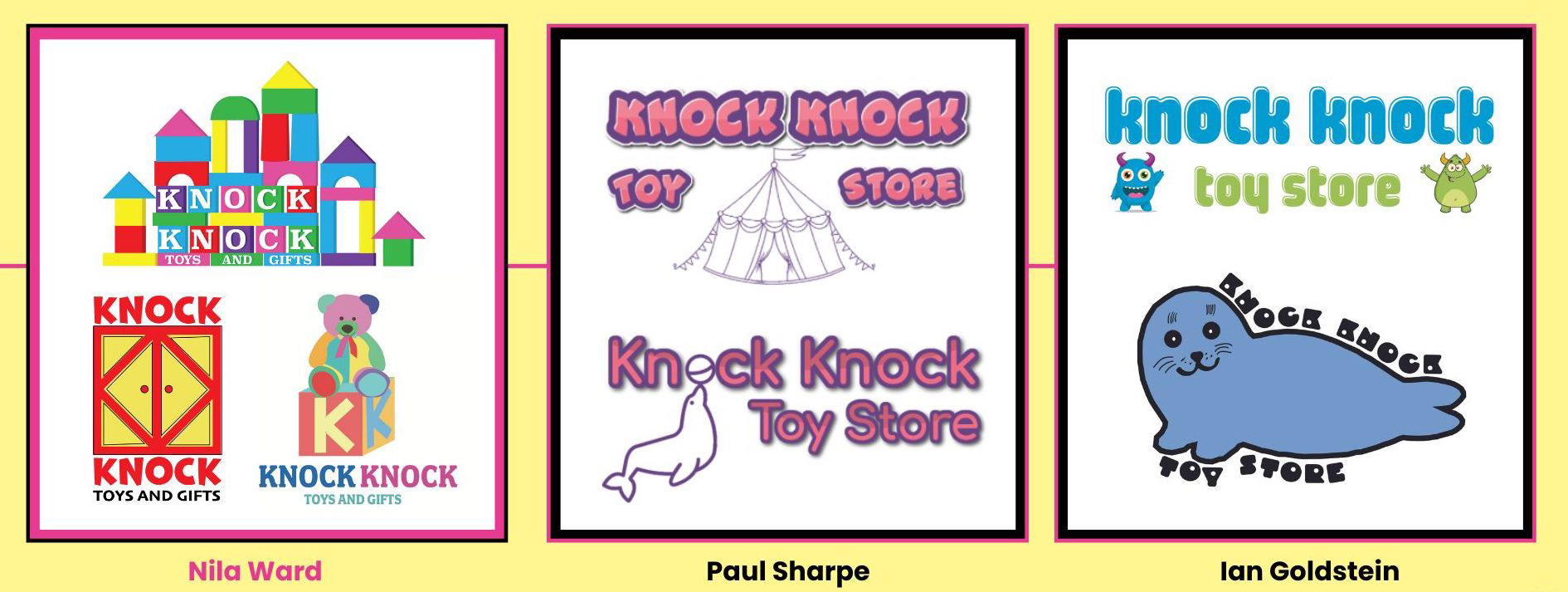
Logos not selected (submitted by each group member)
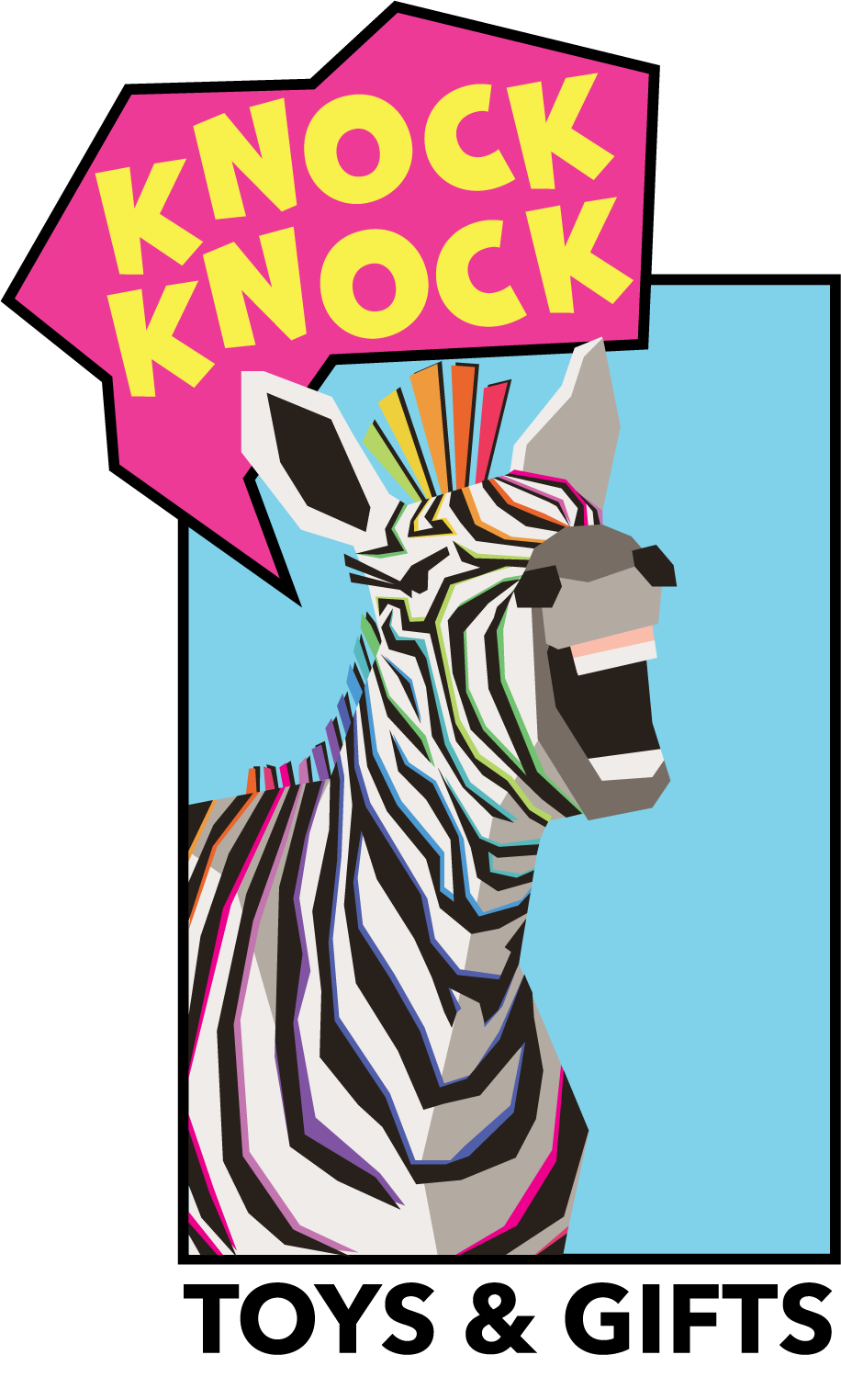
Final Logo Design
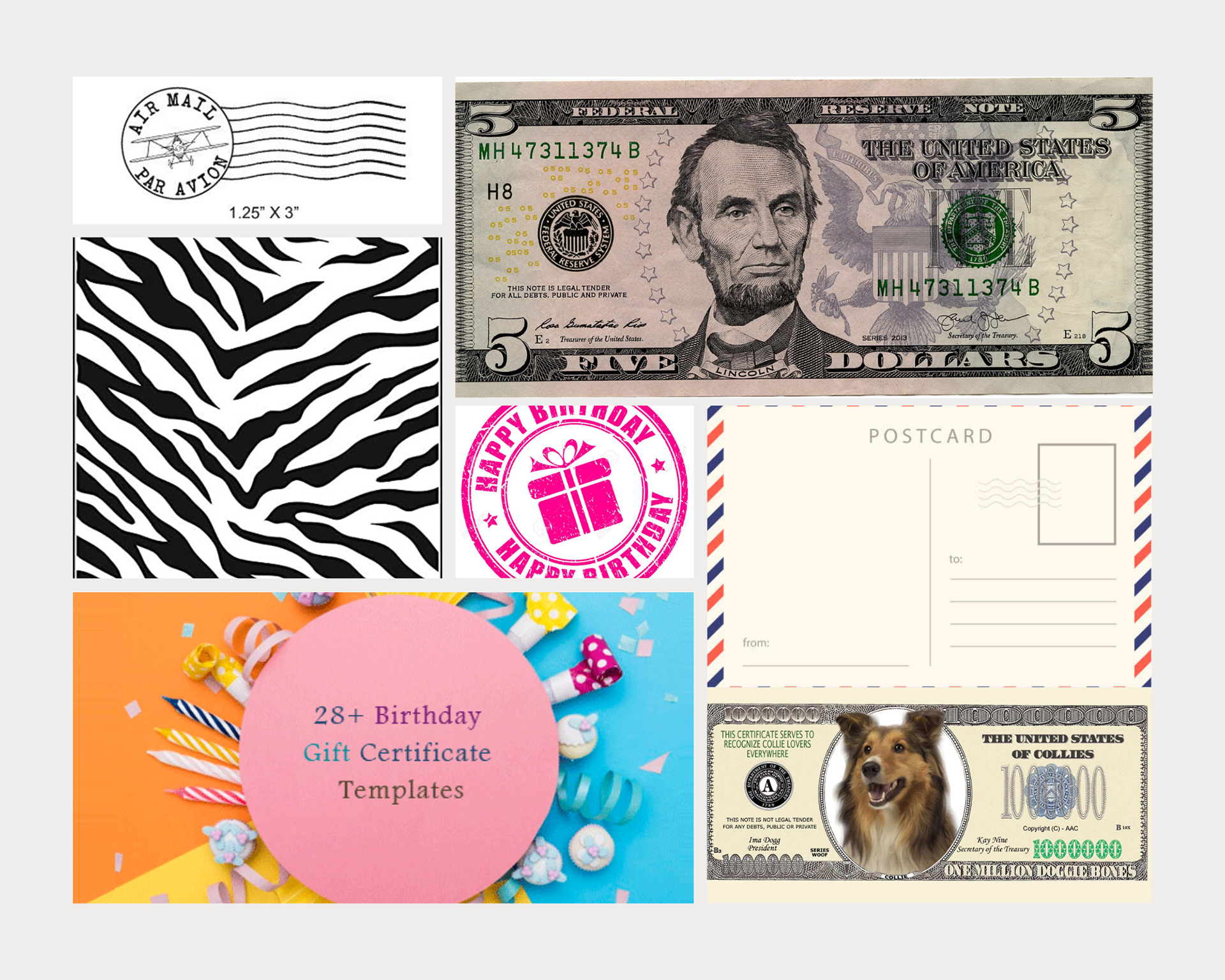
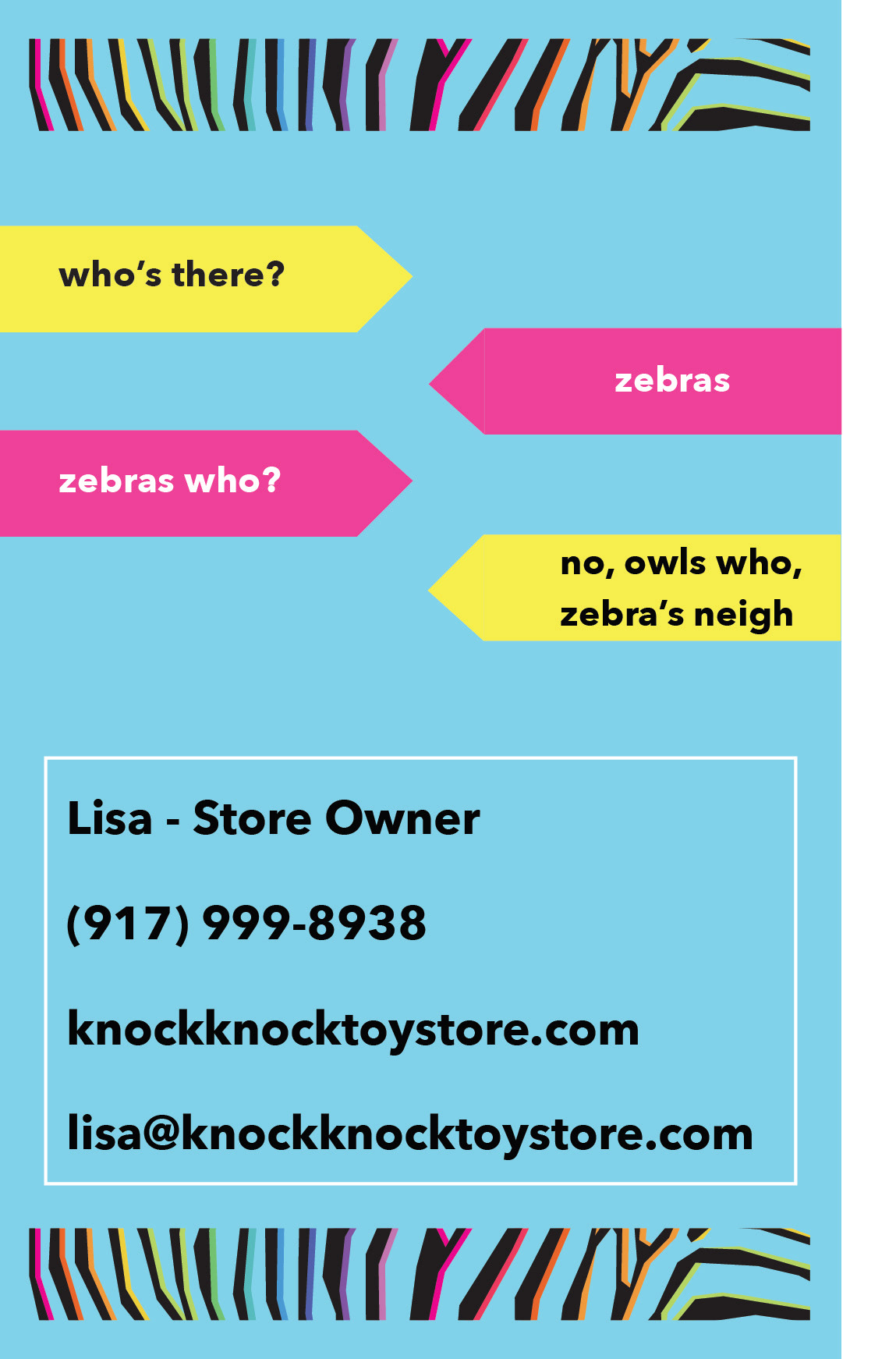
Postcard Process: Knock Knock sends a yearly birthday mailer their kid customers, with $5 "Birthday Bucks" to spend on whatever they would like at the store. I wanted to find a way to incorporate the zebra character into a $5 bill that would be a fun and exciting item for kids to receive in the mail
Mailer mood board
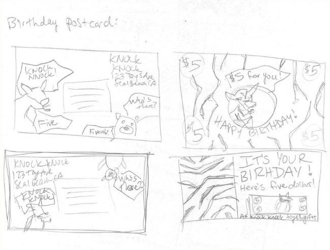
Mailer sketch
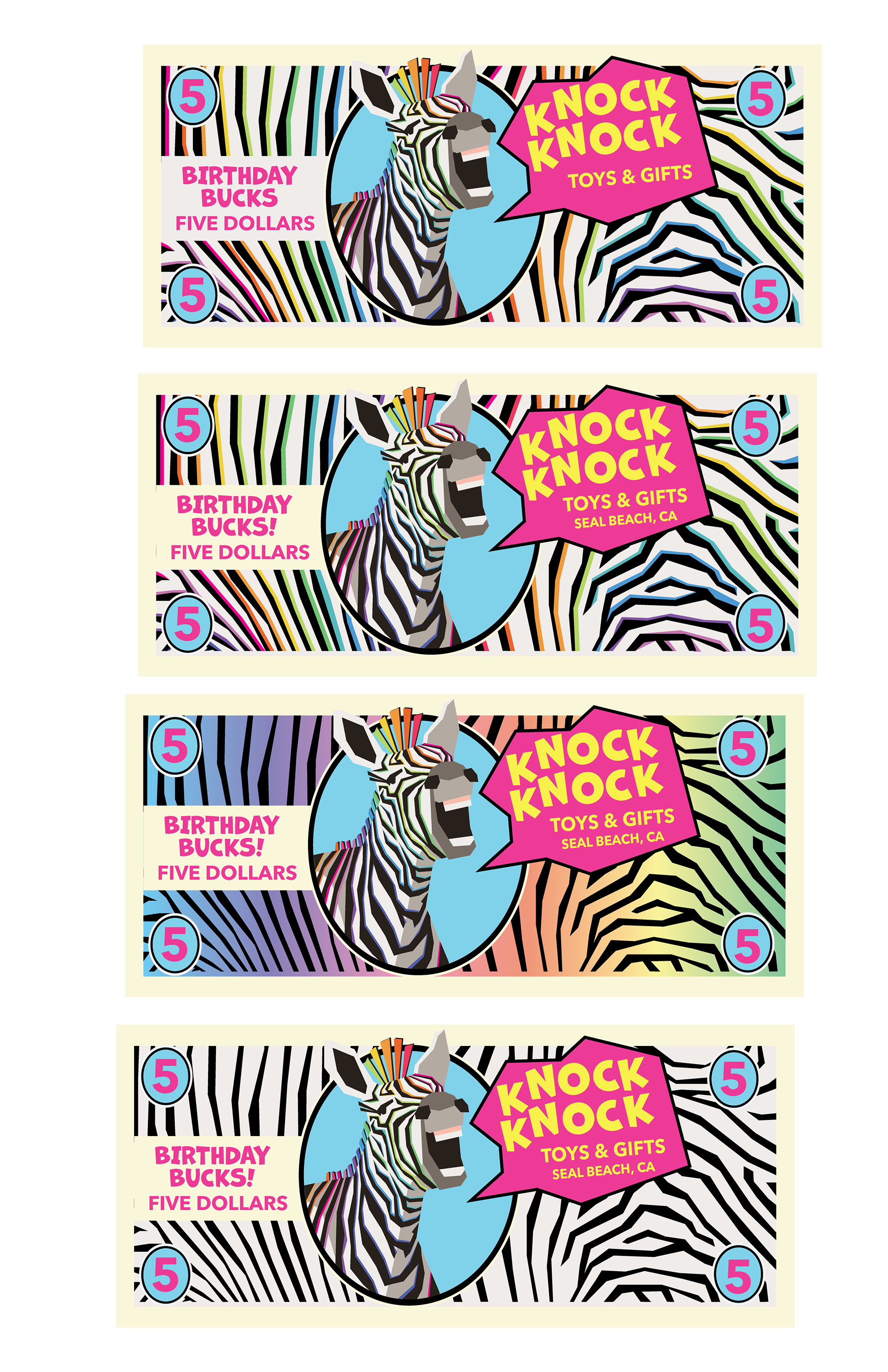
Mailer illustration roughs
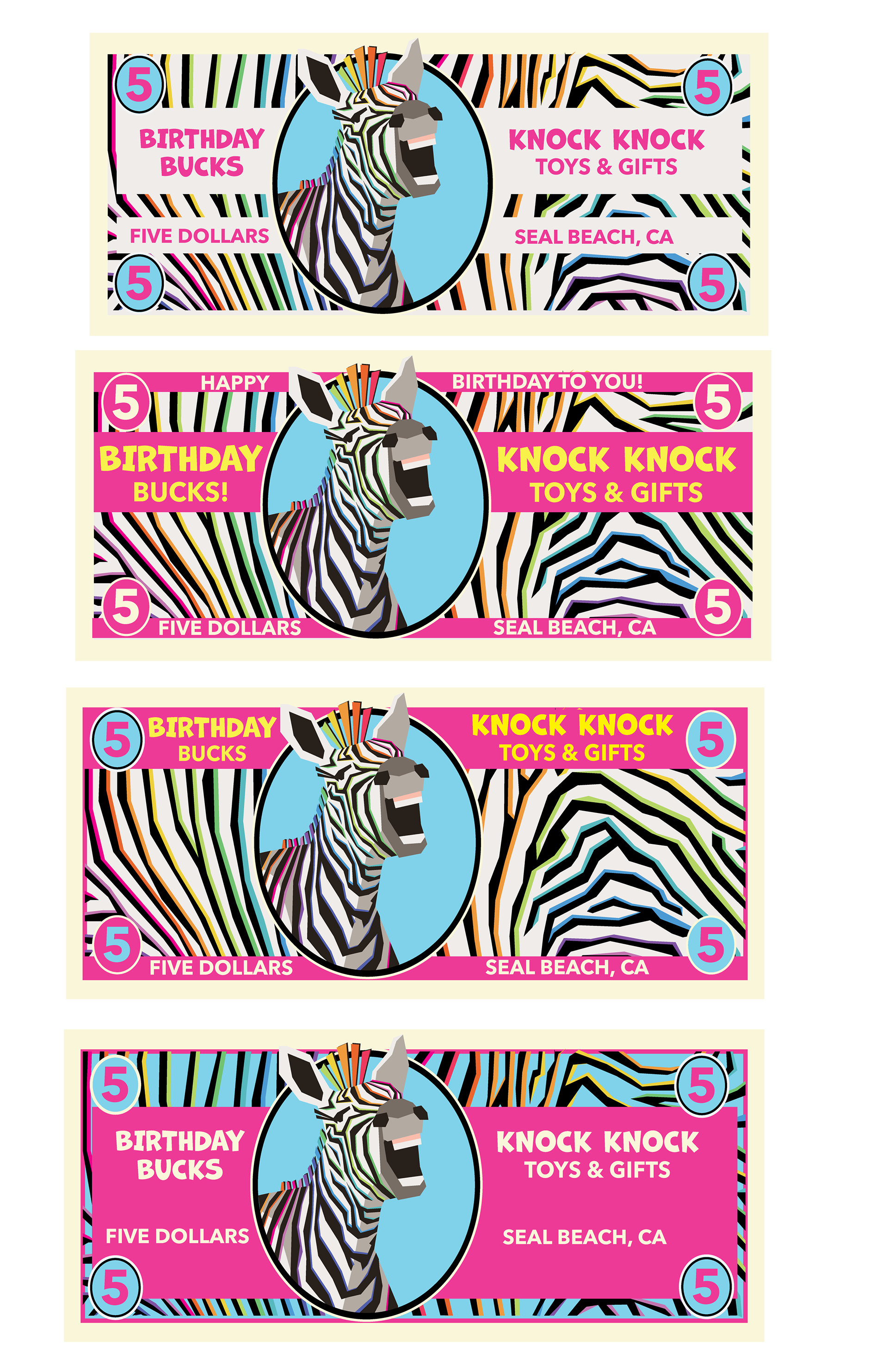
Mailer illustration roughs
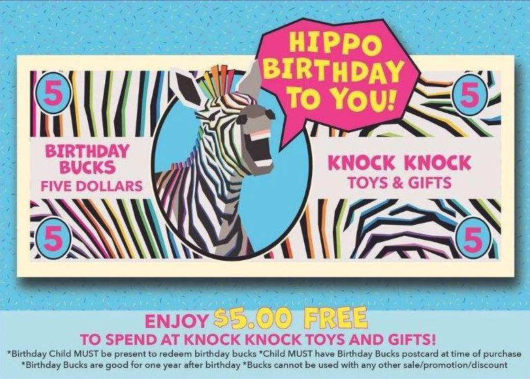
Postcard mailer front
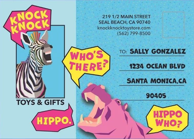
Postcard mailer back
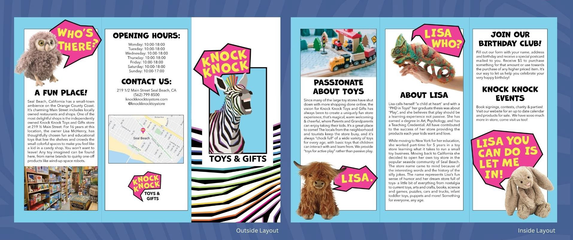
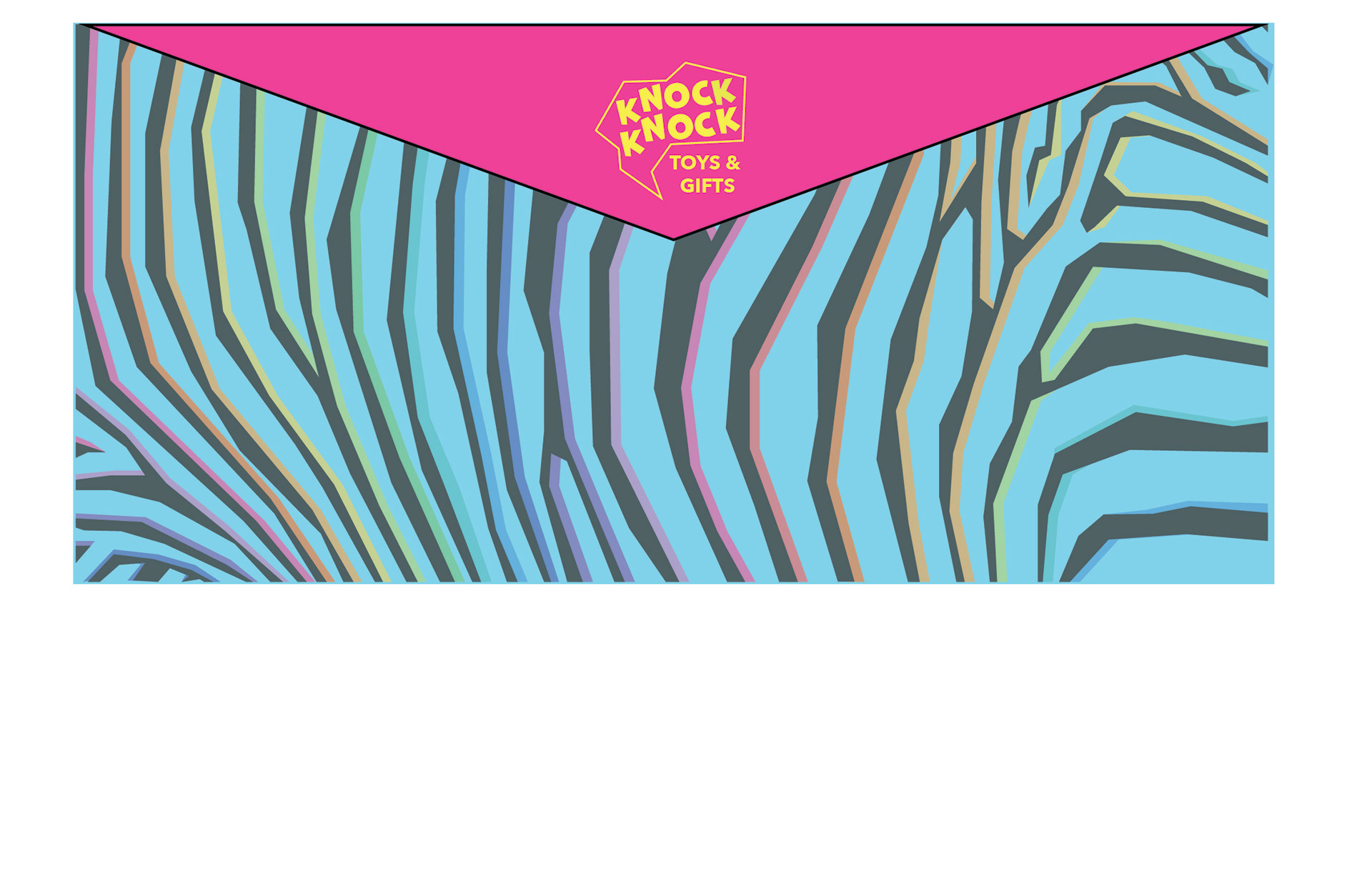
Brochure Process: The brochure features information on the store & its owner Lisa, photos of toys, and a clever knock knock joke. I used the same stylized speech bubbled as seen in the logo to create an interactive experience of reading through the brochure.
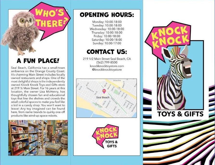
Brochure outside fold
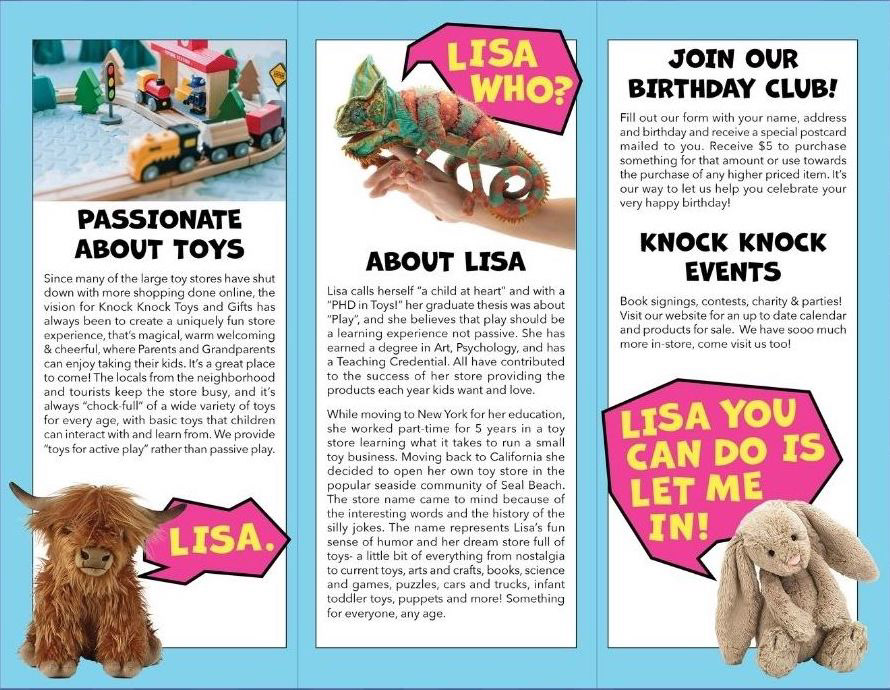
Brochure inside fold
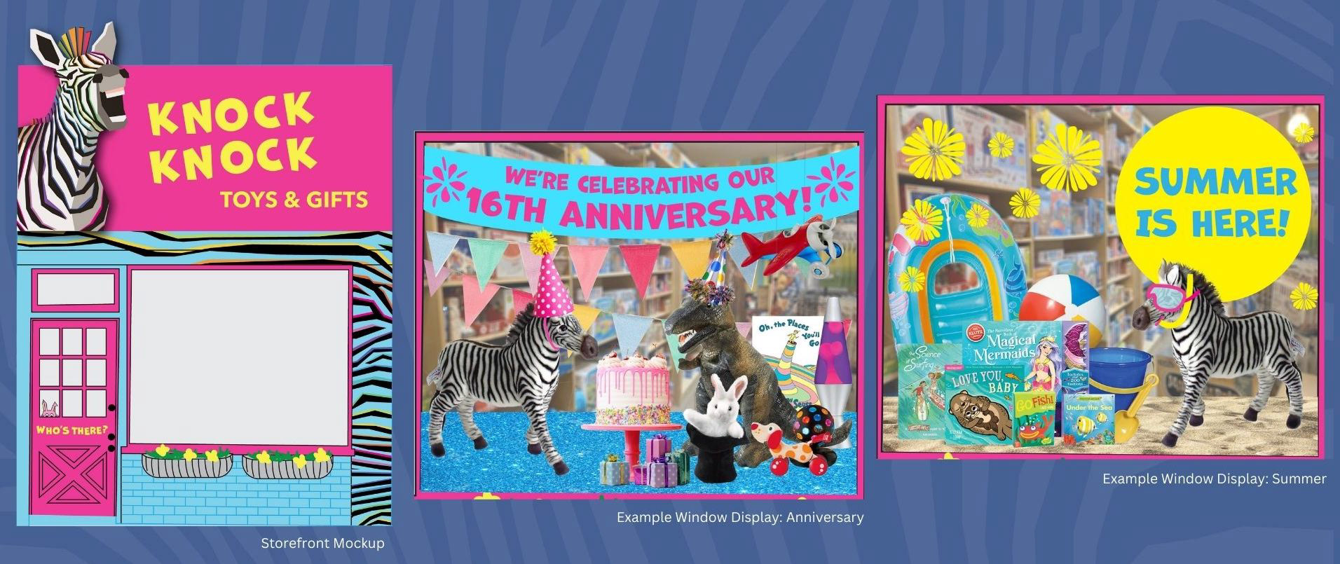
Storefront Process: The current storefront is very simple and unassuming: a white building with a red awning. While creating the moodboard, I was most attracted to the buildings with bold paint jobs and graphics, that would surely catch kids' attentions and have them begging to enter the store. I wanted to find a way to make the storefront more of an attraction that would help it to become a landmark store on the street
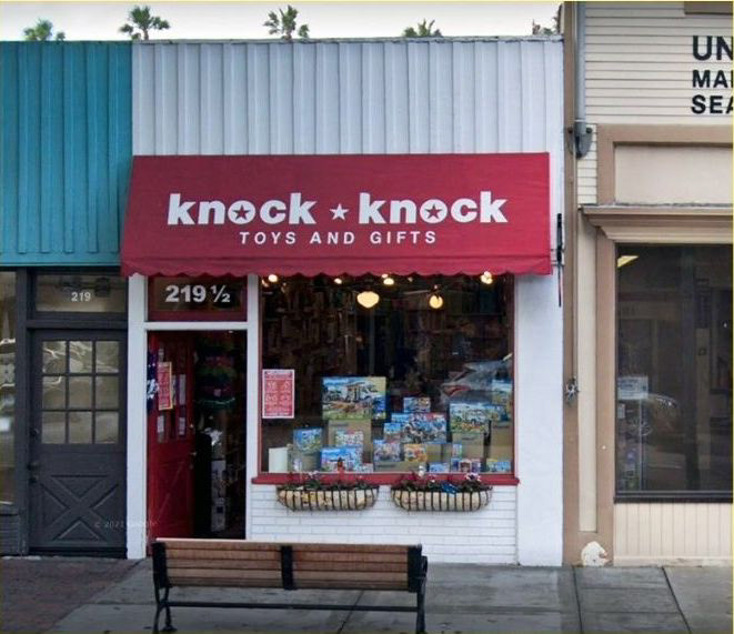
Current storefront
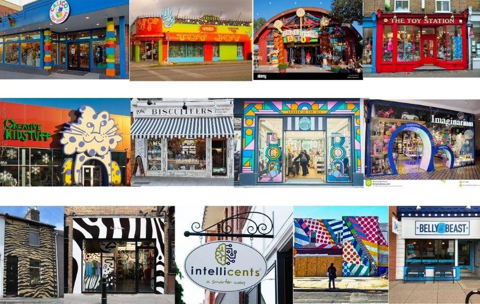
Storefront mood board
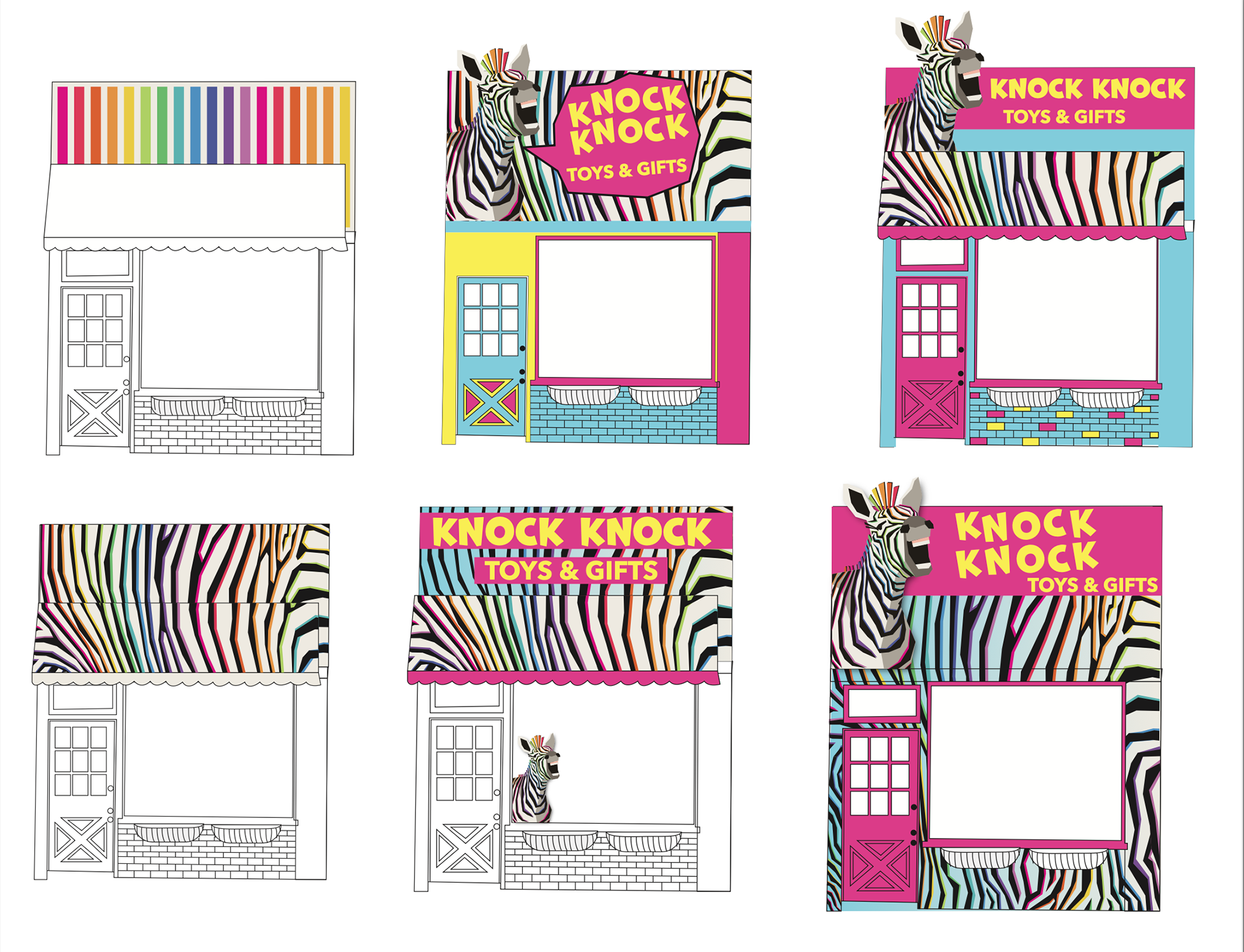
The storefront facelift called for something bold, colorful, and eye-catching.I played with different usages of the zebra print and the mascot to find the best solution for a store
that would draw attention.
that would draw attention.
I also was asked to work on some mockups for window displays for different seasons. The idea of having a stuffed zebra go on different "adventures" in the storefront with the other toys seemed like a fun way to get people invested in the story of the store and offered lots of versatility for creative displays.
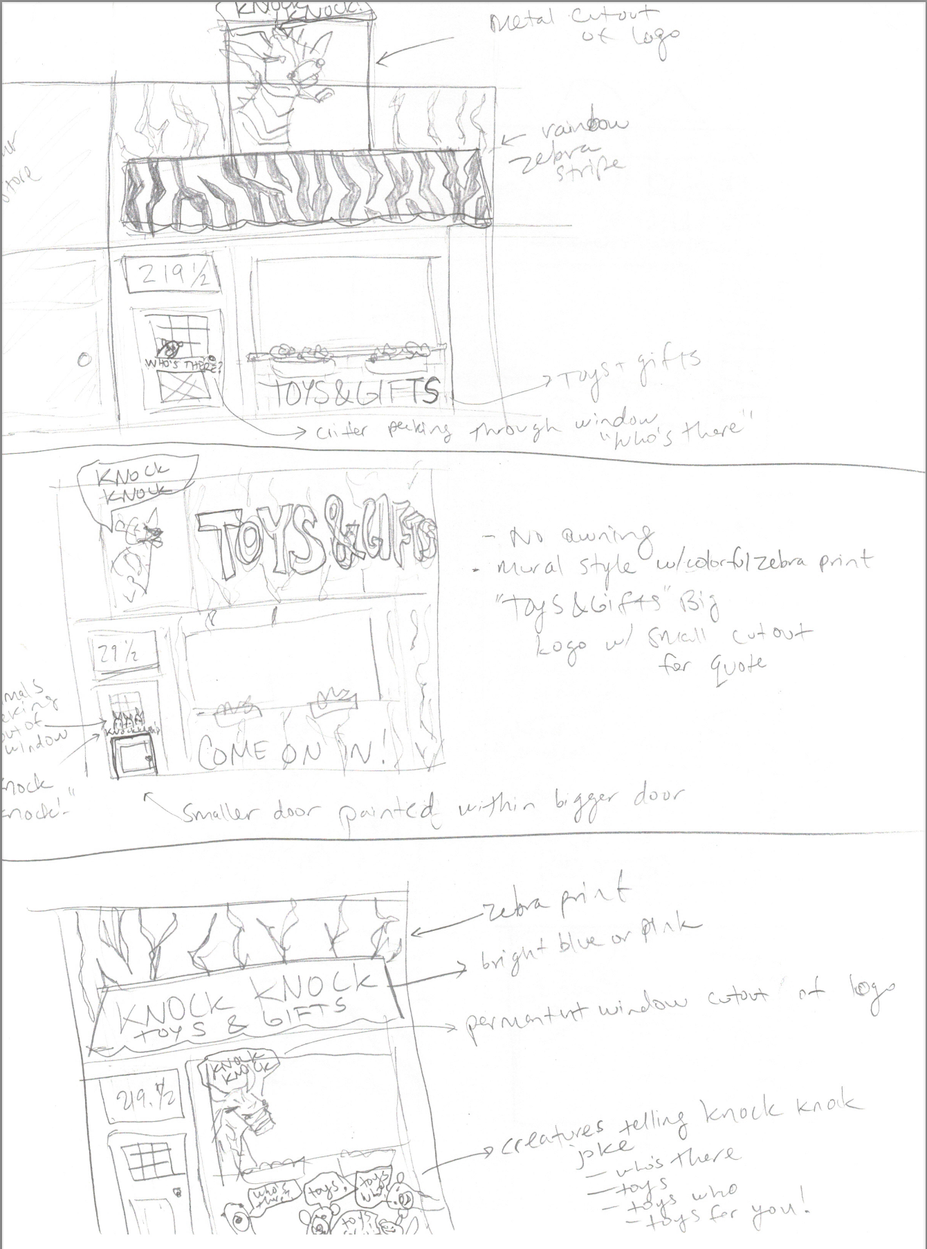
Storefront sketches
Storefront digital sketches
Storefront redesign
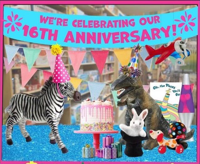
Anniversary window display
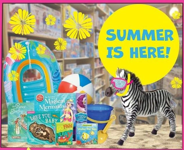
Summertime window display
Some of my group member's work using my logo and zebra print:
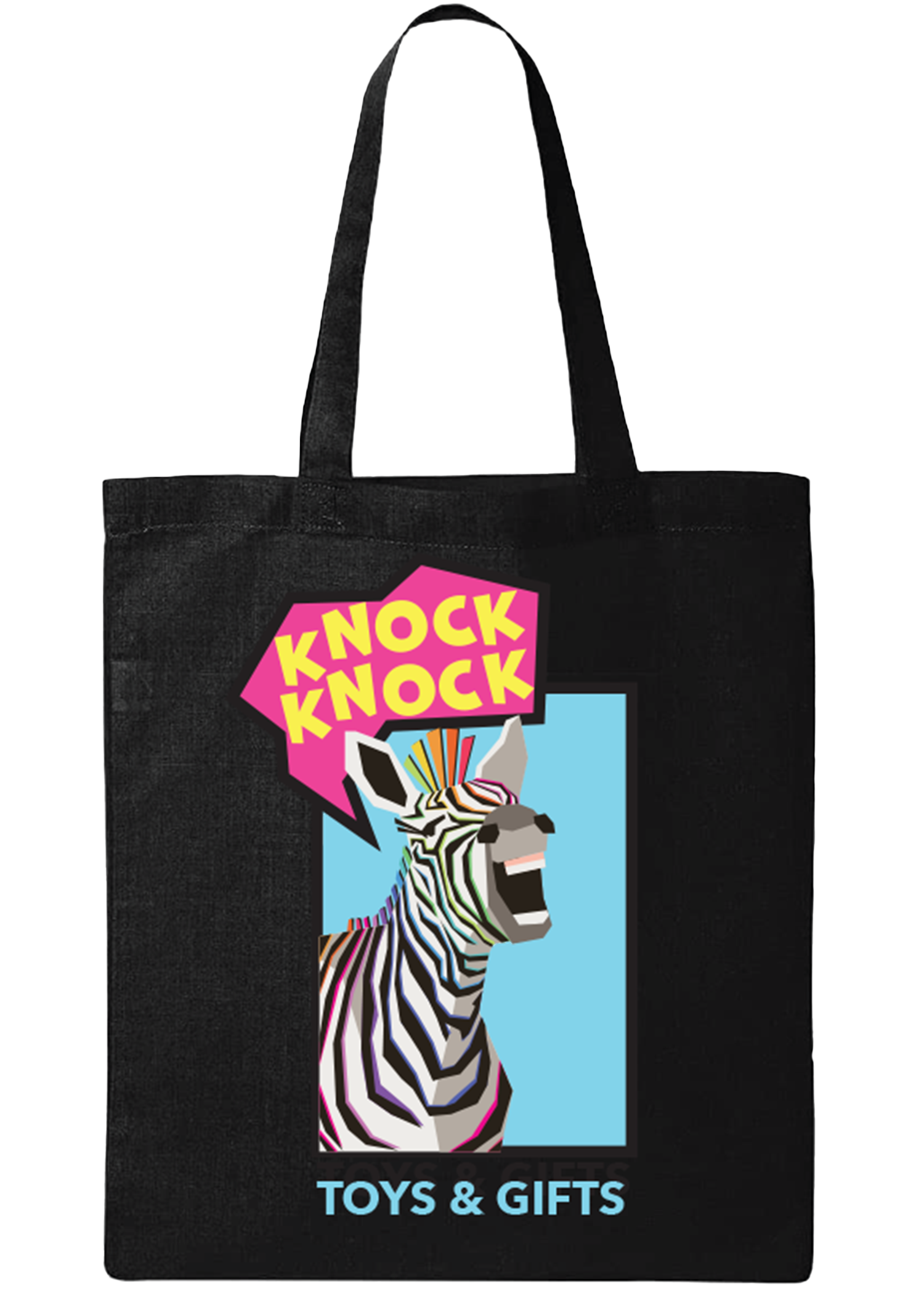
Bag merchandise (Paul Sharpe)
Business card front (Paul Sharpe)
Business card back (Paul Sharpe)
Stationary (Paul Sharpe)
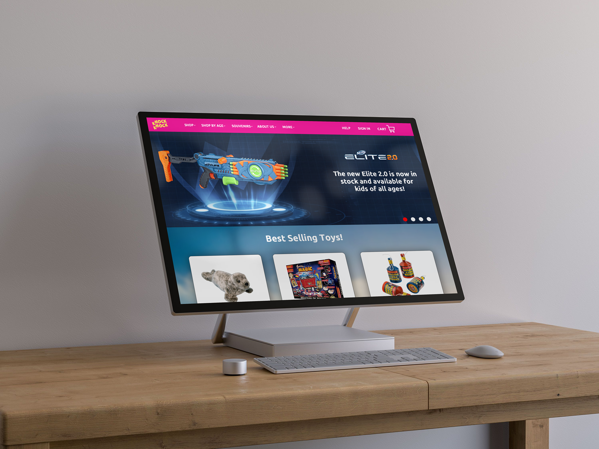
Website mockup (Ian Goldstein)
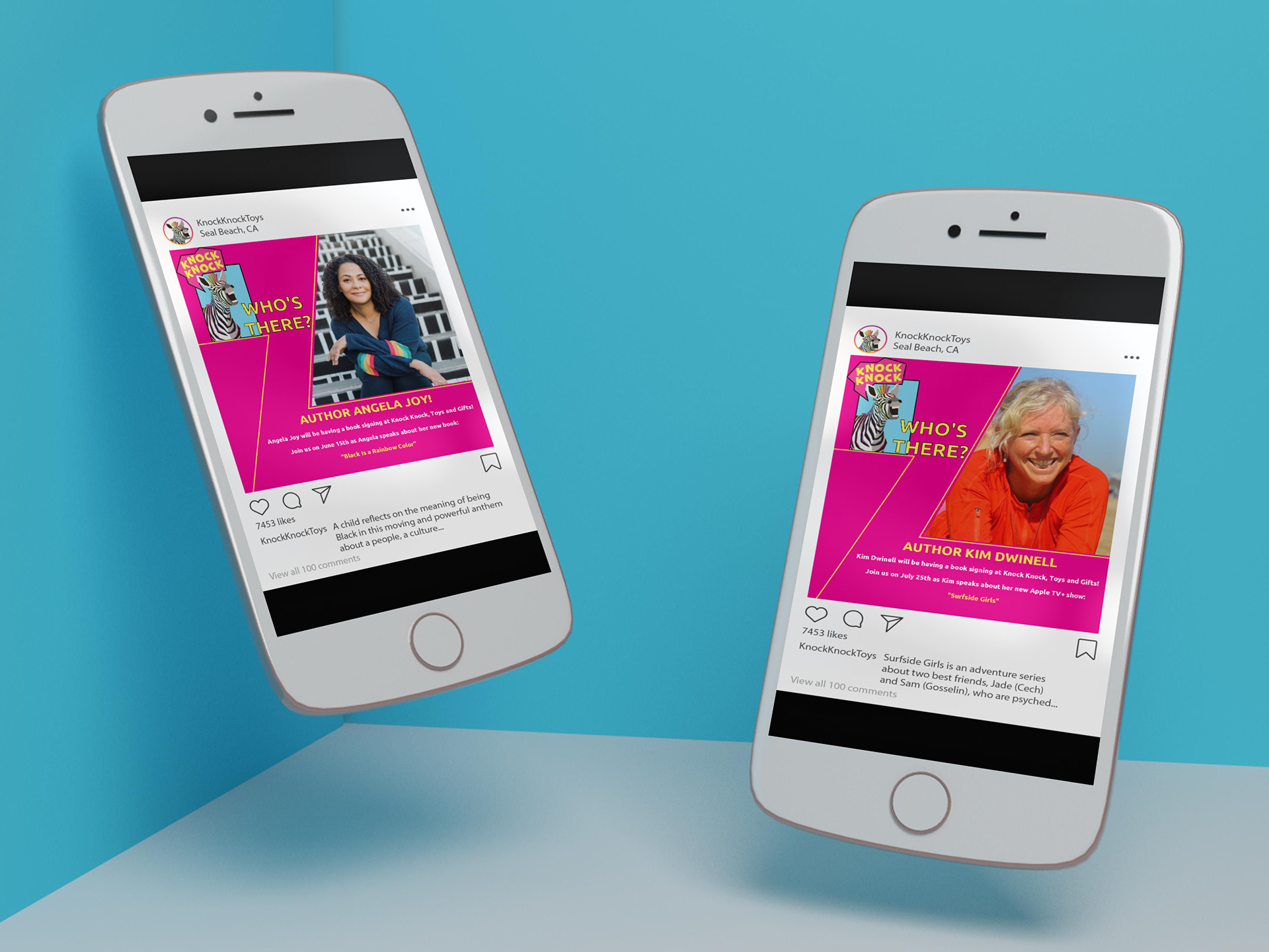
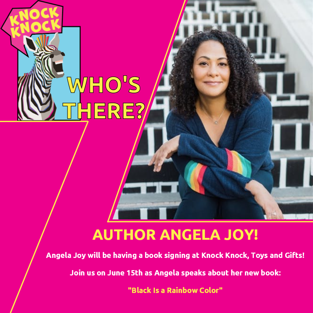
Social media mockup (Ian Goldstein)
Social media mockup (Ian Goldstein)
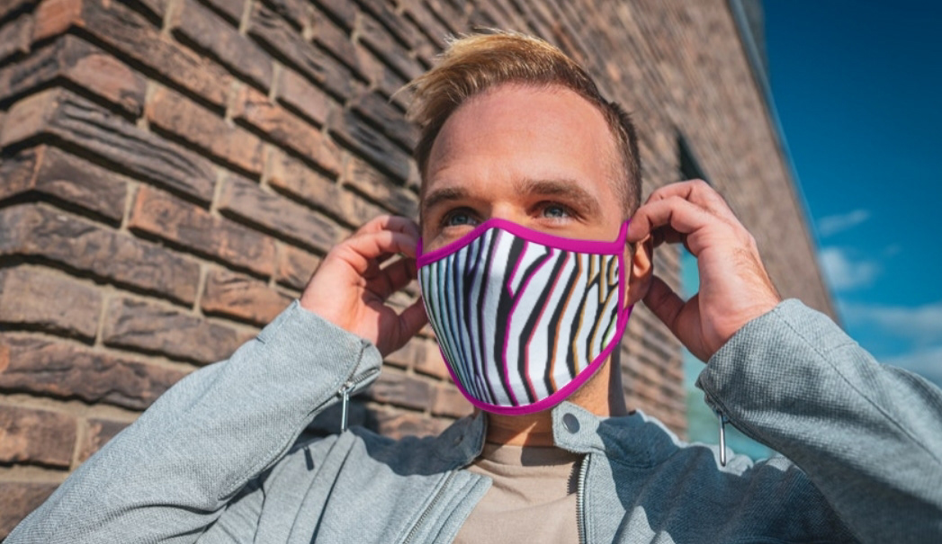
Mask merchandise mockup (Ian Goldstein)
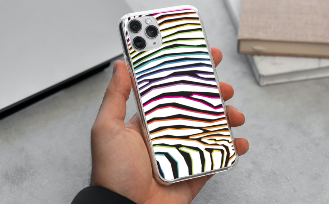
Phone case merchandise mockup (Ian Goldstein)
Results & Reflections: Our group worked together to develop a cohesive new idea for the Knock Knock Toys & Gifts brand, including a new logo, colors, marketing materials, website, and merchandise.
The client's feedback was positive. She loved the idea of leaning into the "Knock Knock Joke" and appreciated the color choices and thought process behind giving the store a new unique identity. She commented that the illustration style brought a new energy to the store that may help her to attract customers.
This project gave me the opportunity to experiment with a new illustration style and work in leading a group of graphic designers, keeping them on task and ensuring that we could present a unified design at the end of the project.