Alex Trochut at the Getty
Brief: In this academic project, I was asked to create an exhibition poster for a typography designer. I chose to highlight Alexander Trochut, a Spanish artist who creates super interesting typography, illustrations, and designs. Using Adobe Photoshop, Illustrator, & InDesign, I created a series of four posters, each spotlighting a different aspect of Trochut's work.


Process
I was inspired by bold imagery, strong colors, and simplicity in the layout, placing emphasis on highlighting the typography. Trochut's work demands attention, and I wanted to experiment with how I could use it to draw viewers in.
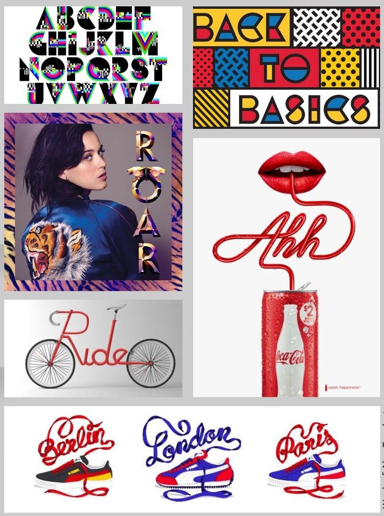
Trochut's work
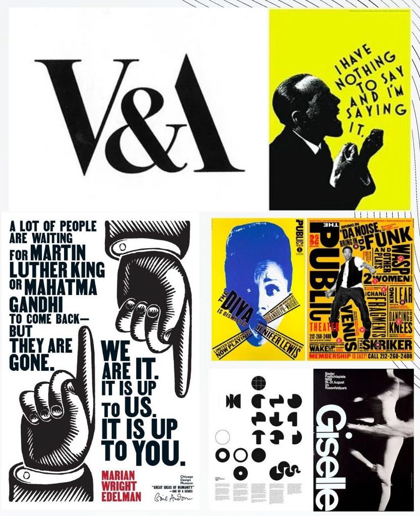
Inspiration
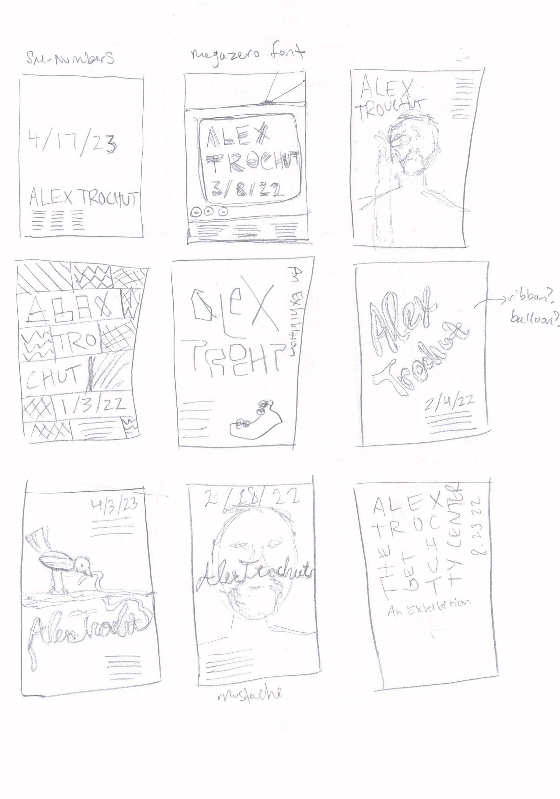
Sketches
Poster #1: Utopian type. This poster uses Trochut's colorful Utopian font and models itself after Trochut's work, with the use of the primary colors, boxes, and geometric patterns.
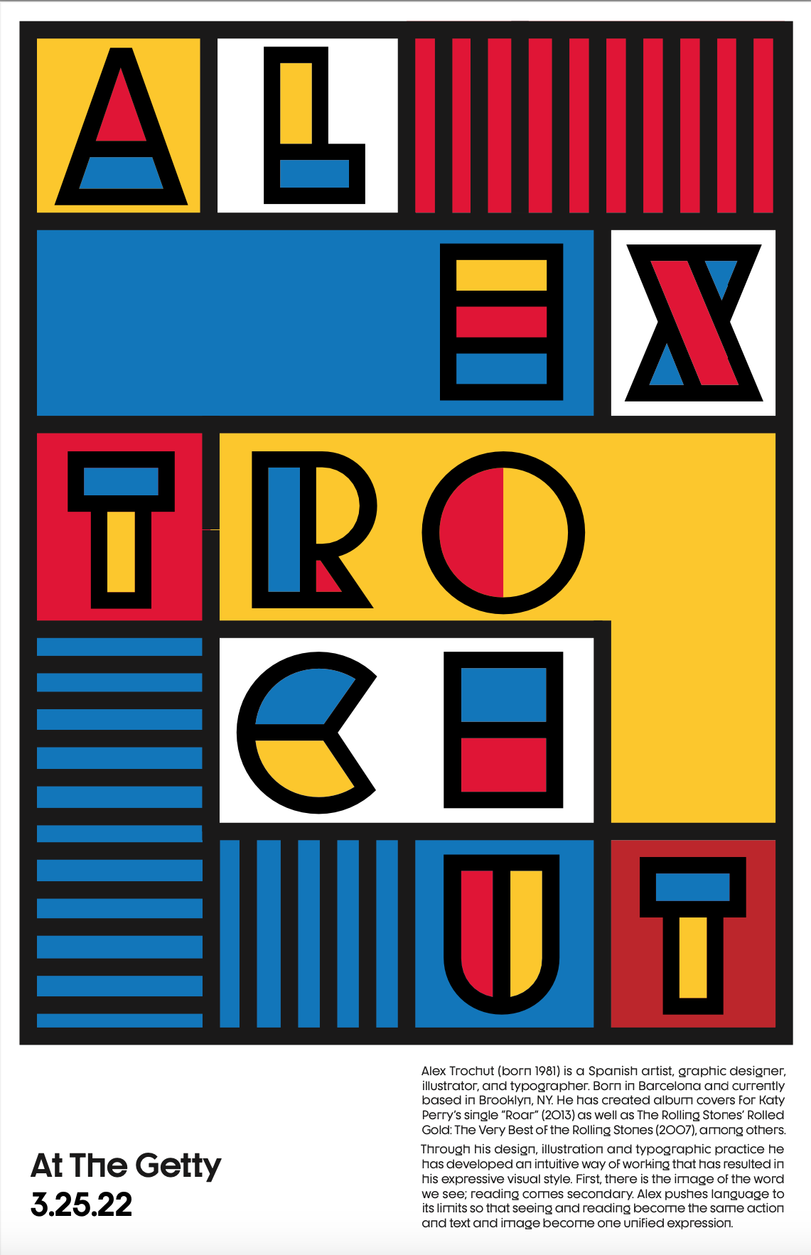
Poster #1
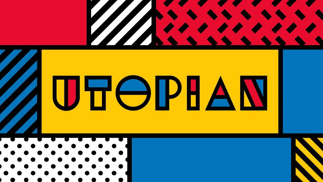
Trochut's Utopian
Poster #2: Utopian type. To make this poster, I edited a photo of the artist in photoshop then used his Utopian font to write out his name.

Poster #2
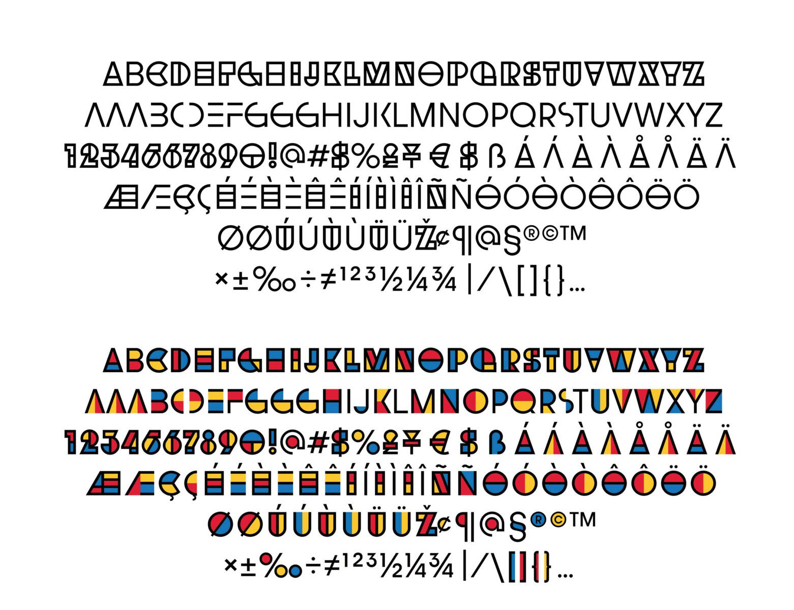
Trochut's Utopian
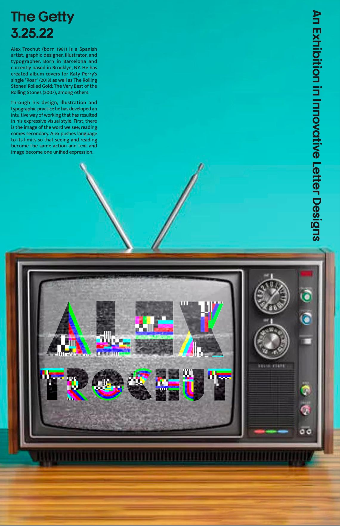
Poster #3: Megazero type. This type reminded me of old technology, so I incorporated it into a photograph of an old television to help tell a story with the type.

Poster #3
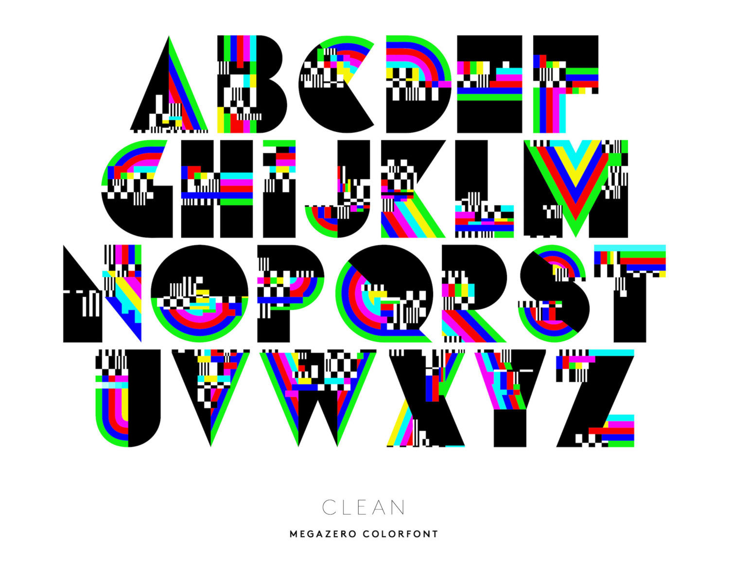
Trochut's Megazero
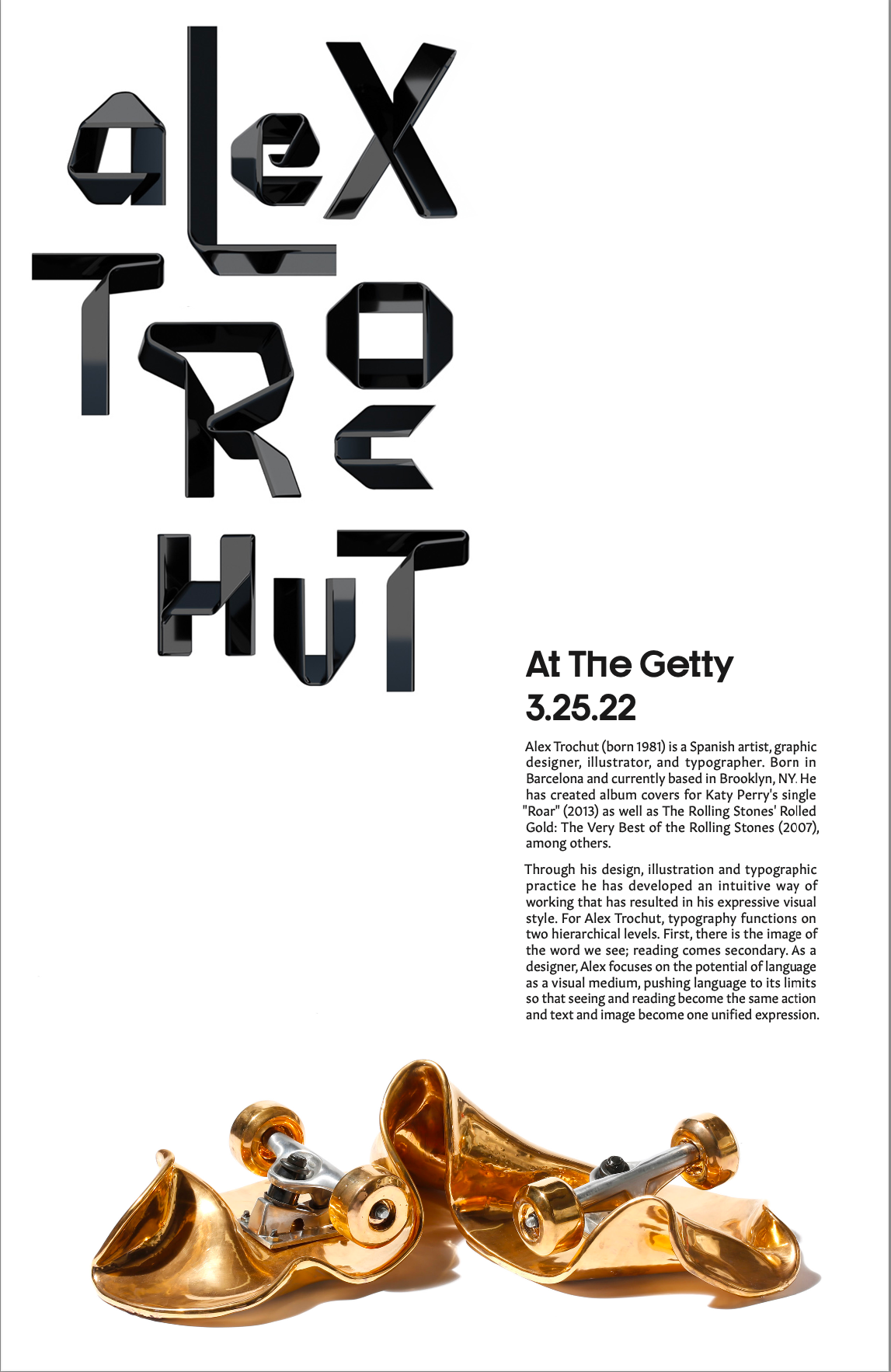
Poster #4: Skate Fails. This version of the poster stayed simple, letting Trochut's typography and art do the heavy lifting, with the layout leading the eye through the copy to the golden skateboard.

Poster #4
Trochut Type
Reflection: The challenge in this project was to find creative ways to highlight another designer's work while adding my own voice to the overall design of the poster. It was fun to pick out different editions of Trochut's typography to use in the designs, and inspirational to review his body of work.